Now that we have seen most of the basics, let’s start the fun stuff !
There are two main ways to plot data in R:
Using base graphics, the native R plotting device
Using the package ggplot2 and tidy data frames
ggplot2 is extremely powerful and some people advise not even teaching base graphics to beginners. But I find that some times it’s just quicker/easier with base graphics, so I will still present it, although not in full details.
11.1 Base graphics
11.1.1 Basic plotting
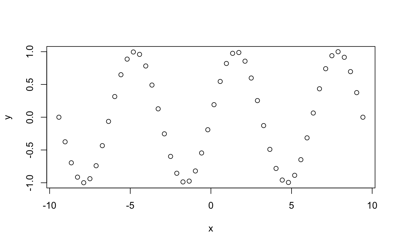
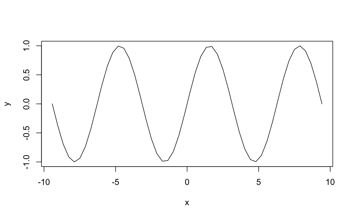
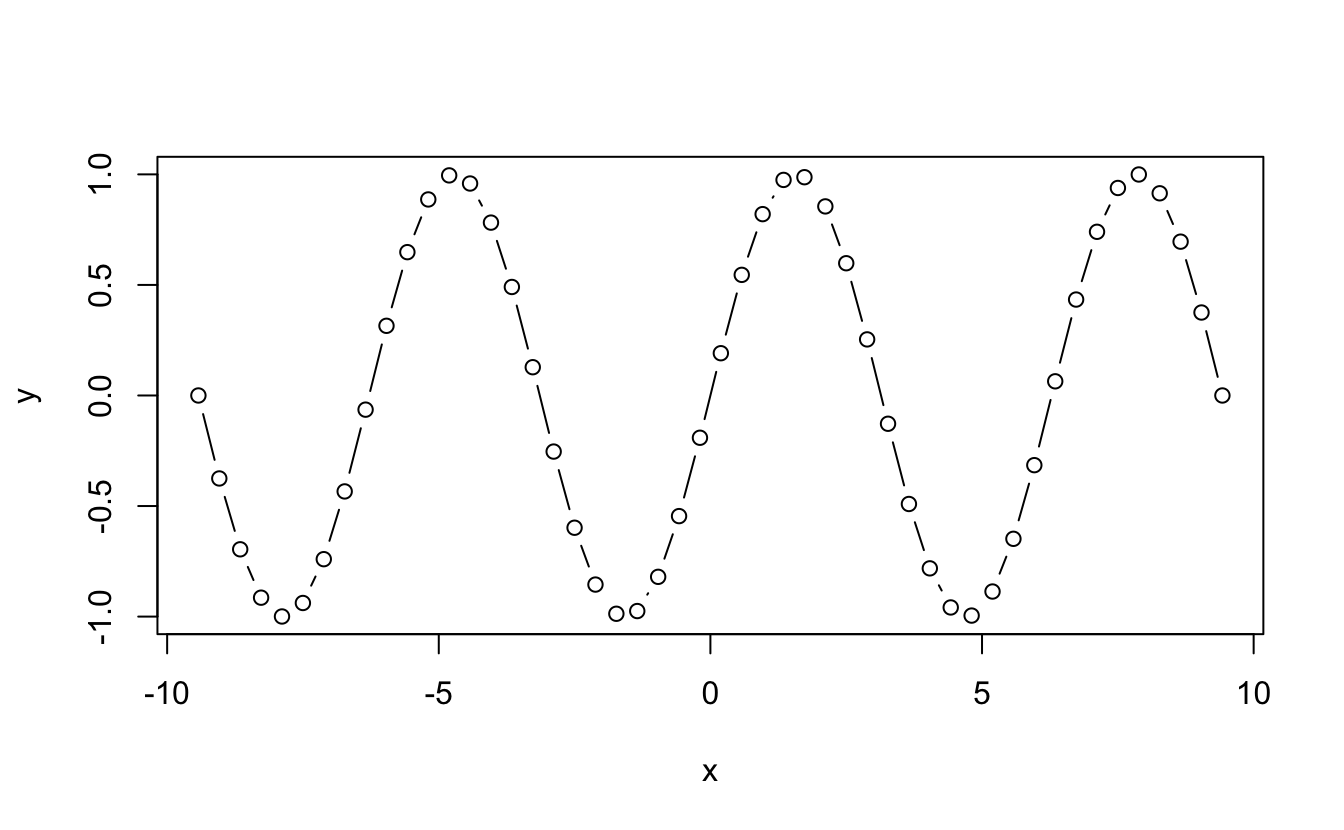
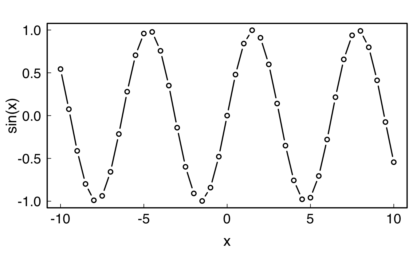
x<-seq(-3*pi,3*pi,length=50)y<-sin(x)z<-sin(x)^2df<-data.frame(x=x, y=y)plot(x,y)# plot providing x and y data
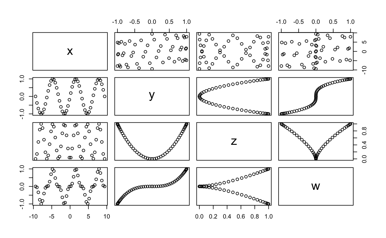
df<-data.frame(x=x, y=y, z=z, w=z*y)plot(df)# plot providing a multi-columns data.frame
11.1.2 Adding some style
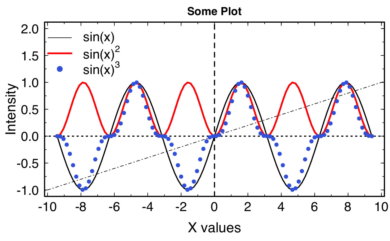
OK, easy. Now let’s do some tuning of this, because it’s a tad ugly… Type in each command and see what they do.
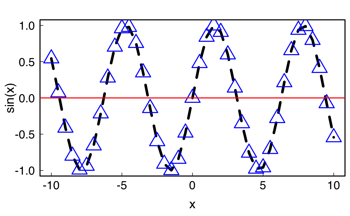
# create some fake datax<-seq(-3*pi,3*pi,length=100)df<-data.frame(x=x, y=sin(x), z=sin(x)^2)# add some styling parameterspar(family ="Helvetica", cex.lab=1.5, cex.axis=1.4, mgp =c(2.4, .5, 0), tck=0.02, mar=c(4, 4, 2, .5), lwd=2, las=1)plot(df$x,df$y, type ="l", # "l" for lines, "p" for points xlab ="X values", ylab ="Intensity", axes =FALSE, main ="Some Plot", ylim =c(-1,2))# vertical line in 0abline(v=0,lty=2,lwd=2)# horizontal line in 0abline(h=0,lty=3,lwd=2)# line with coefficients a (intercept) and b (slope)abline(a=0,b=.1,lty=4,lwd=1)# add a linelines(df$x,df$z,type ="l",col="red",lwd=3)# add pointspoints(df$x,df$z*df$y,col="royalblue",pch=16,cex=1)# add custom axis. # Default with axis(1);axis(2);axis(3, labels=FALSE);axis(4, labels=FALSE);# Bottomaxis(1,at=seq(-10,10,2),labels=TRUE,tck=0.02)axis(1,at=seq(-10,10,1),labels=FALSE,tck=0.01); # small inter-ticks# Topaxis(3,at=seq(-10,10,2),labels=FALSE)axis(3,at=seq(-10,10,1),labels=FALSE,tck=0.01); # small inter-ticks# Leftaxis(2,at=seq(-1,2,.5),labels=TRUE)axis(2,at=seq(-1,2,.25),labels=FALSE,tck=0.01); # small inter-ticks# Rightaxis(4,at=seq(-1,2,.5),labels=FALSE)axis(4,at=seq(-1,2,.25),labels=FALSE,tck=0.01); # small inter-ticks# Draw a boxbox()# Print legendlegend("topleft", cex=1.4, #size of text lty=c(1,1,NA), # type of line (1 is full, 2 is dashed...) lwd=c(1,3,NA), # line width pch=c(NA,NA,16), # type of points col=c("black","red","royalblue"), # color bty ="n", # no box around legend legend=c("sin(x)",expression("sin(x)"^2),expression("sin(x)"^3)))
Most needs should be covered with this simple plot that can be adapted.
Pro Tip: make a code snippet
Go to Rstudio Preferences, Code, Edit code snippets, and add the following lines:
snippet plot#pdf("xxx.pdf", height=6, width=8)par(cex.lab=1.7, cex.axis=1.7, mgp =c(3, 0.9, 0), tck=0.02, mar=c(4.5, 4.5, 1, 1), lwd =3, las=1)plot(${1:x},${2:y},type="l", # plot with a lineylim=c( , ),xlim=c( , ),lwd=2, # width of the linelty=1, # type of lineaxes=FALSE, # do not show axesxlab="${1:x}", # x labelylab="${2:y}", # y labelmain="") # Titlelegend("topright",cex=1.5, # size of the textpch=c(), # list of point typeslty=c(), # list of line typeslwd=c(), # list of line widthscol=c(), # list of line colorsbty="n", # no box around the legendlegend=c() # list of legend labels )# Draw axes with minor ticksaxis(1, at=seq(0,1,.2), labels=TRUE)axis(1, at=seq(0,1,.1), labels=FALSE, tck=0.01)axis(3, at=seq(0,1,.2), labels=FALSE)axis(3, at=seq(0,1,.1), labels=FALSE, tck=0.01)par(mgp =c(2.5, 0.2, 0))axis(2, at=seq(0,10,1), labels=TRUE)axis(2, at=seq(0,10,.5), labels=FALSE, tck=0.01)axis(4, at=seq(0,10,1), labels=FALSE)axis(4, at=seq(0,10,.5), labels=FALSE, tck=0.01)box() # drow box around plot#dev.off()
Going further
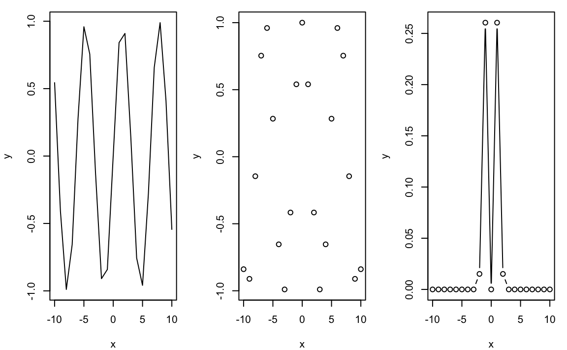
11.1.2.1 Panel plots
Lets create a plot with different panels (a bit ugly without styling, you need to tweak the margins and text distance to plot with par(mar(), mgp()) before each plot):
# some fake datax<-seq(-10,10,1)d1<-data.frame(x=x, y=sin(x))d2<-data.frame(x=x, y=cos(x))d3<-data.frame(x=x, y=exp(-x^2)*sin(x)^2)# on a simple grid, use:# par(mfrow=c(nrows, ncols))par(mfrow=c(1, 3), mar=c(4,4,1,1))plot(d1,type="l")plot(d2,type="p")plot(d3,type="b")
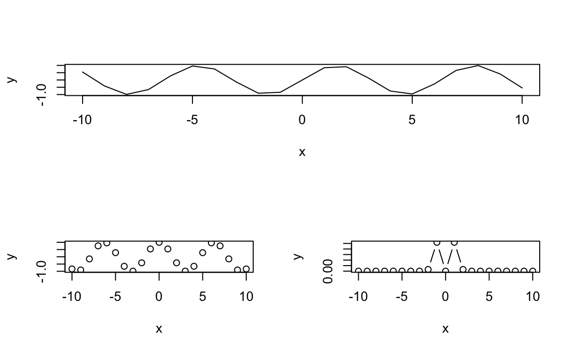
# creating the layout and stylingM<-matrix(c(c(1,1),c(2,3)), byrow=TRUE, ncol=2); M
#>      [,1] [,2]
#> [1,]    1    1
#> [2,]    2    3
nf<-layout(M, heights=c(1), widths=c(1))# first plotplot(d1,type="l")# second plotplot(d2,type="p")# third plotplot(d3,type="b")
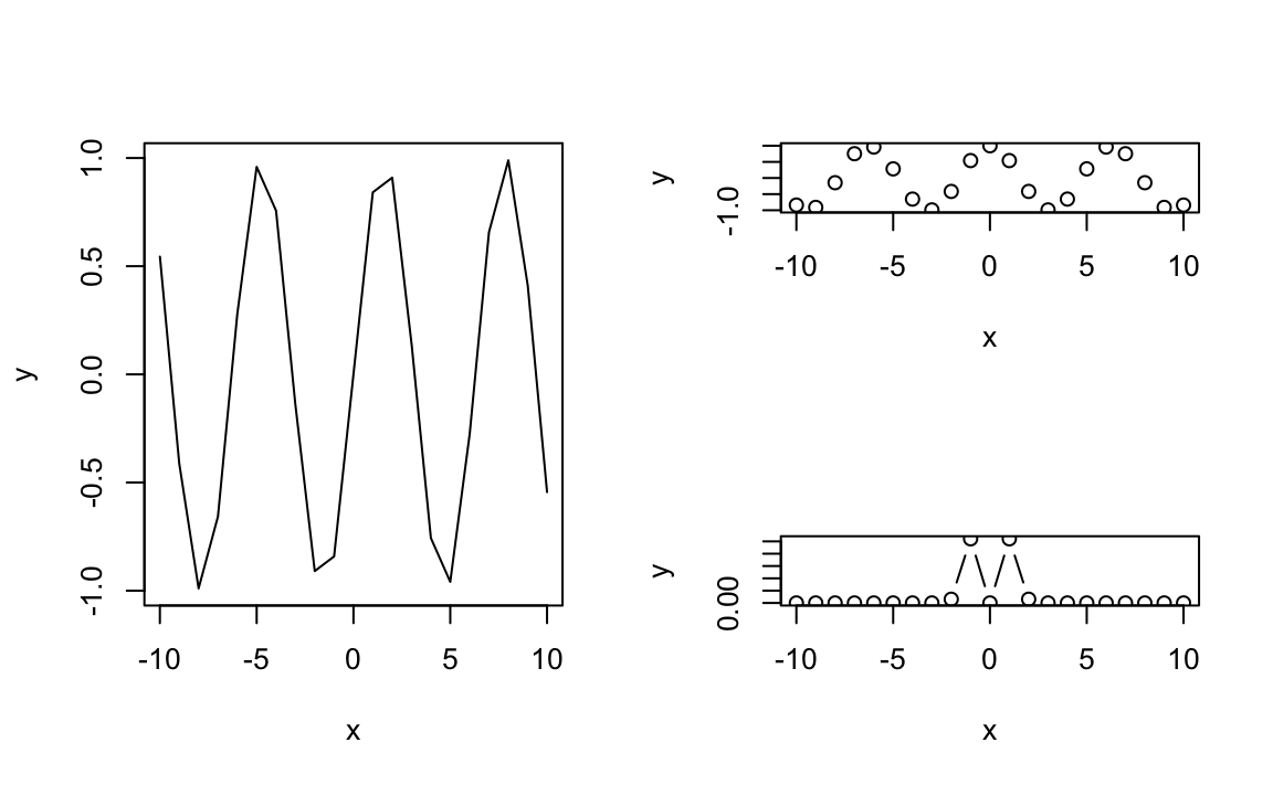
# creating the layout and stylingM<-matrix(c(c(1,1),c(2,3)), byrow=FALSE, ncol=2); M
#>      [,1] [,2]
#> [1,]    1    2
#> [2,]    1    3
nf<-layout(M, heights=c(1), widths=c(1))# first plotplot(d1,type="l")# second plotplot(d2,type="p")# third plotplot(d3,type="b")
ggplot2 is a package (now even available for python) that completely changes the methodology of plotting data. With ggplot2, data are gathered in a tidydata.frame, and each column can be used as a parameter to tweak colors, point size, etc.
is enough, as it will load ggplot2 and most of the useful data manipulation libraries.
11.2.1 The grammar of graphics
With ggplot2 is introduced the notion of “grammar of graphics” through the function ggplot(). What it means is that the plots are built through independent blocks that can be combined to create any wanted graphical display. To construct a plot, you need to provide building blocks such as:
data gathered in a tidy data.frame
an aesthetics mapping: what column is x, y, the color, the size, etc…
geometric object: point, line, bar, histogram, tile…
statistical transformations if needed
scales: color_manual, x_continuous, …
coordinate system
faceting: wrap, grid
theme: theme_bw(), theme_light()…
The typical call to ggplot() is thus (the arguments between <> are yours to specify):
Since a figure is worth a thousand words, let’s get to it. We will use the dataset diamonds built-in with the ggplot2 package. Let’s have a look:
diamonds
#> # A tibble: 53,940 × 10
#>    carat cut       color clarity depth table price     x     y     z
#>    <dbl> <ord>     <ord> <ord>   <dbl> <dbl> <int> <dbl> <dbl> <dbl>
#>  1  0.23 Ideal     E     SI2      61.5    55   326  3.95  3.98  2.43
#>  2  0.21 Premium   E     SI1      59.8    61   326  3.89  3.84  2.31
#>  3  0.23 Good      E     VS1      56.9    65   327  4.05  4.07  2.31
#>  4  0.29 Premium   I     VS2      62.4    58   334  4.2   4.23  2.63
#>  5  0.31 Good      J     SI2      63.3    58   335  4.34  4.35  2.75
#>  6  0.24 Very Good J     VVS2     62.8    57   336  3.94  3.96  2.48
#>  7  0.24 Very Good I     VVS1     62.3    57   336  3.95  3.98  2.47
#>  8  0.26 Very Good H     SI1      61.9    55   337  4.07  4.11  2.53
#>  9  0.22 Fair      E     VS2      65.1    61   337  3.87  3.78  2.49
#> 10  0.23 Very Good H     VS1      59.4    61   338  4     4.05  2.39
#> # ℹ 53,930 more rows
diamonds contains 53940 lines and 10 columns in a tibble. ggplot2 can easily handle such large dataset.
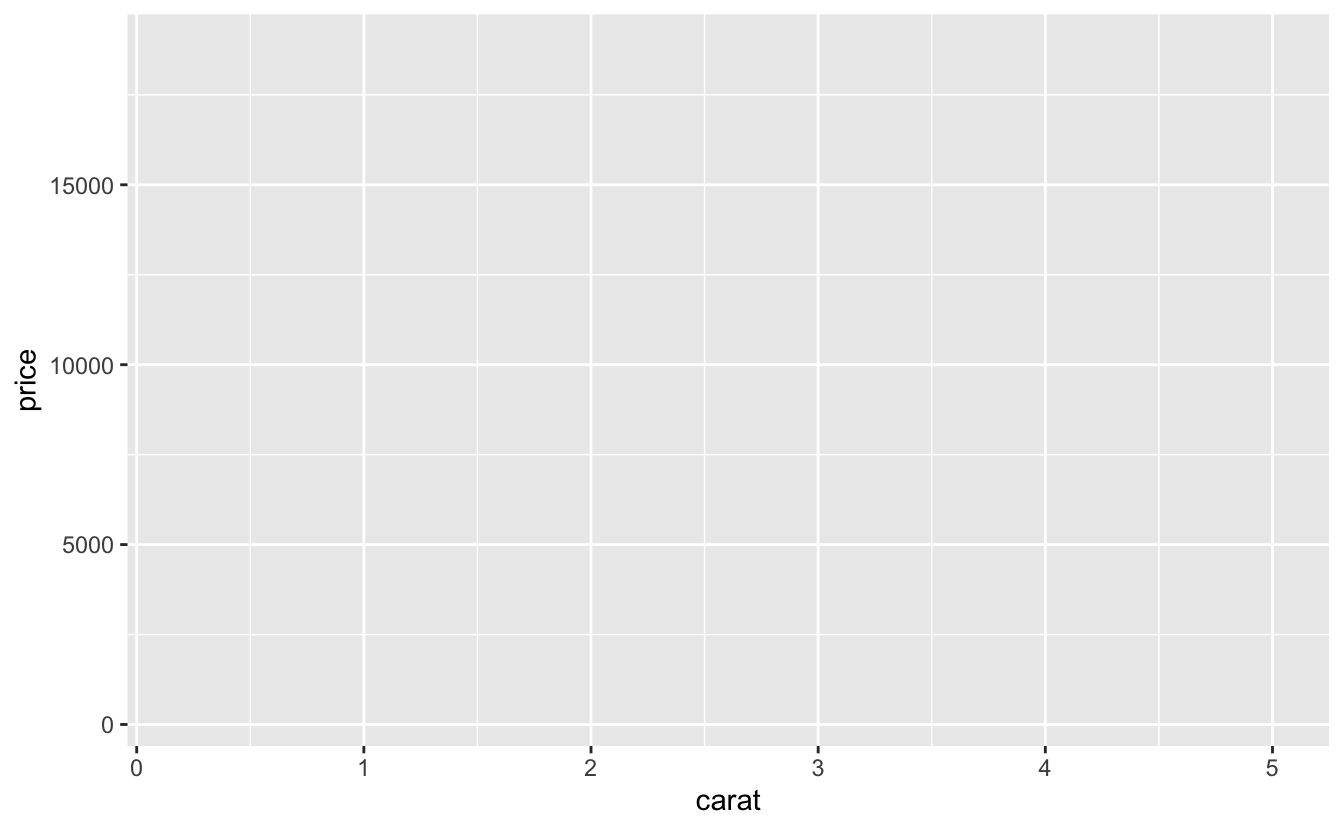
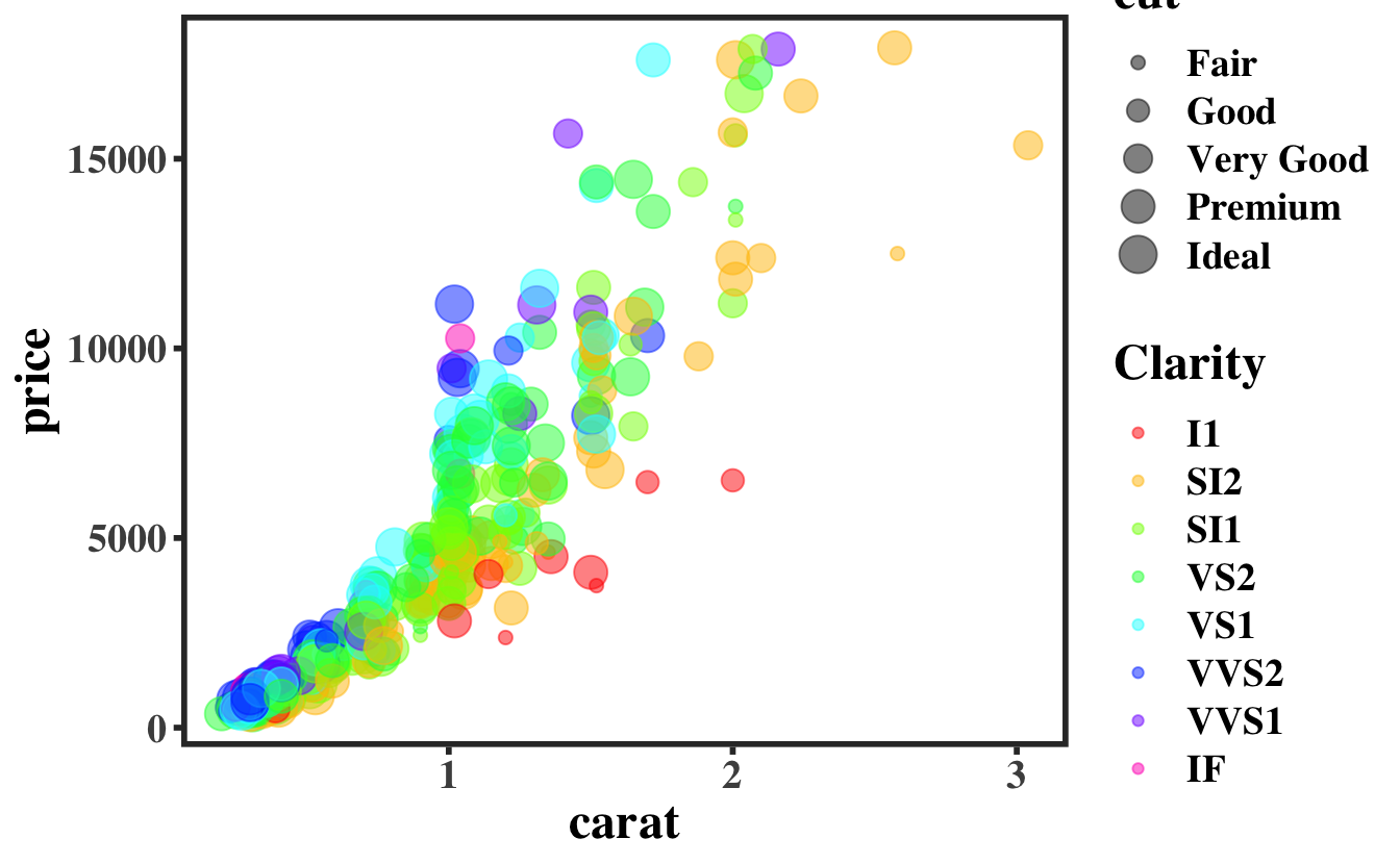
Let’s say we want to see whether there is a correlation between price and weight (carat) of the diamonds. We will make a call to ggplot() by providing it the data and the x and y mapping:
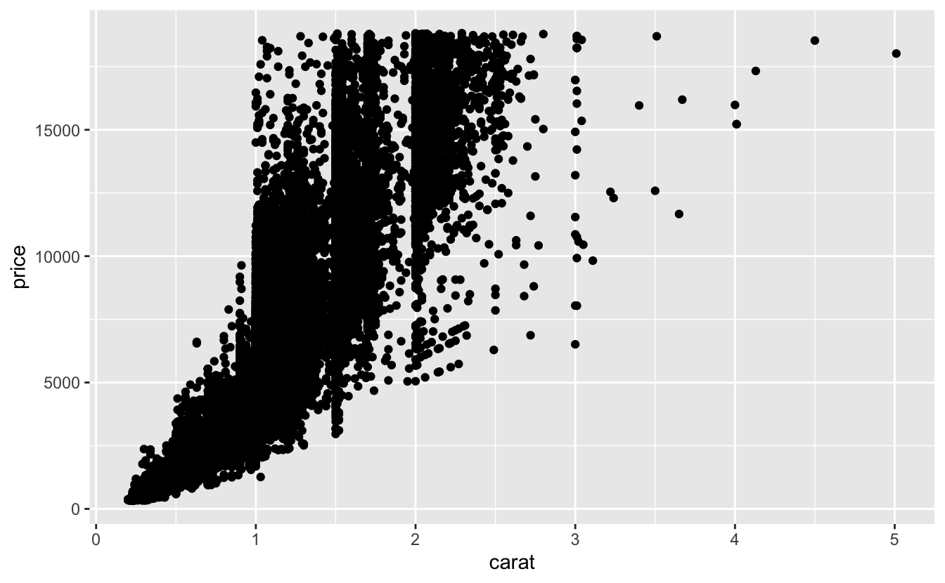
but it does not display any data points. For this we have to add a geometry to the plot, using one of the geom_xx() functions. Let’s plot it using points for now:
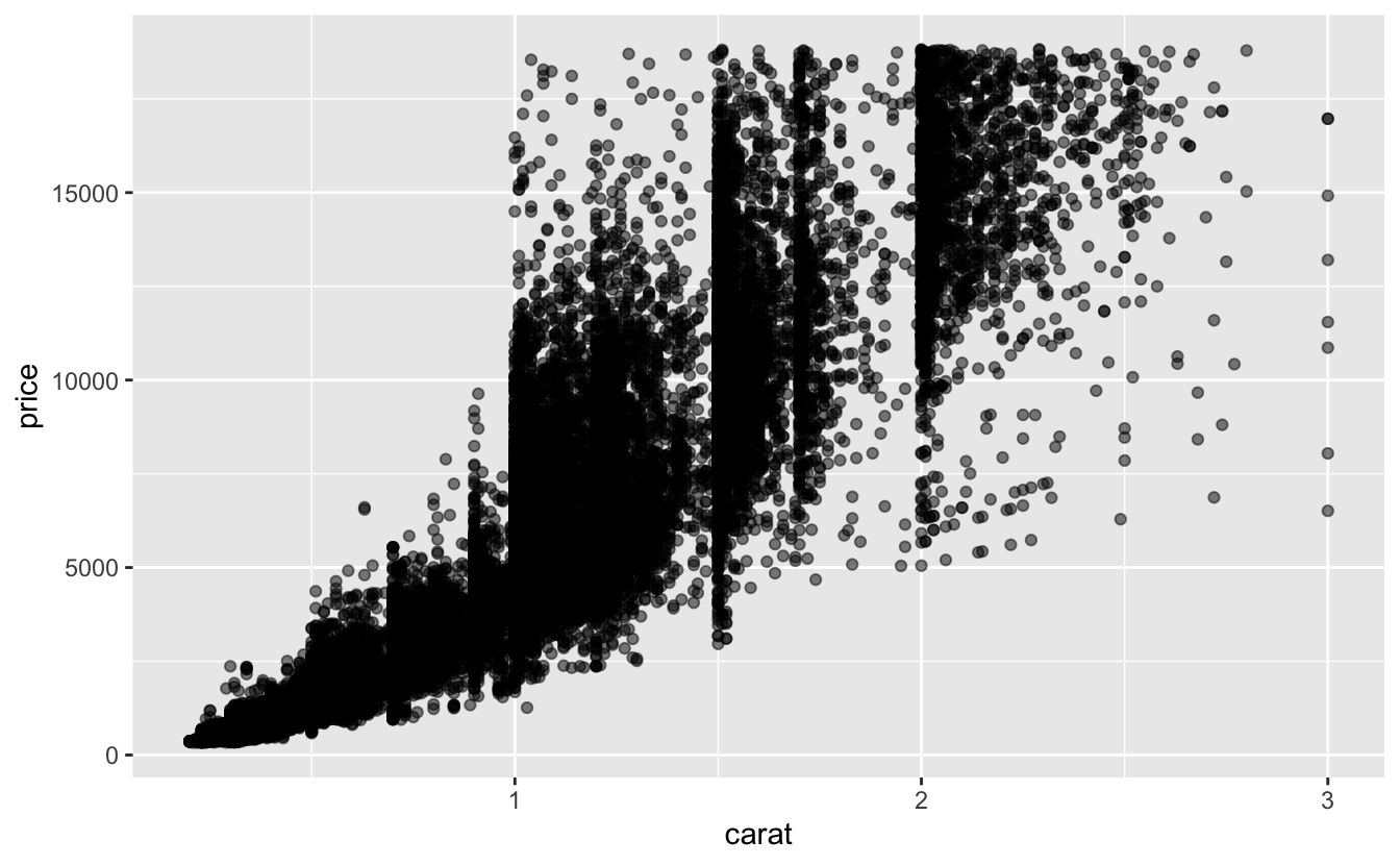
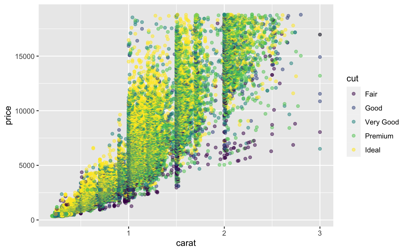
OK, we’re onto something, but we can probably add some information to this plot. We will first cut the data above 3 carats because they are not relevant, and add some transparency to the points to see some statistical information. Let’s make use of the pipe operator |> to make this easily readable:
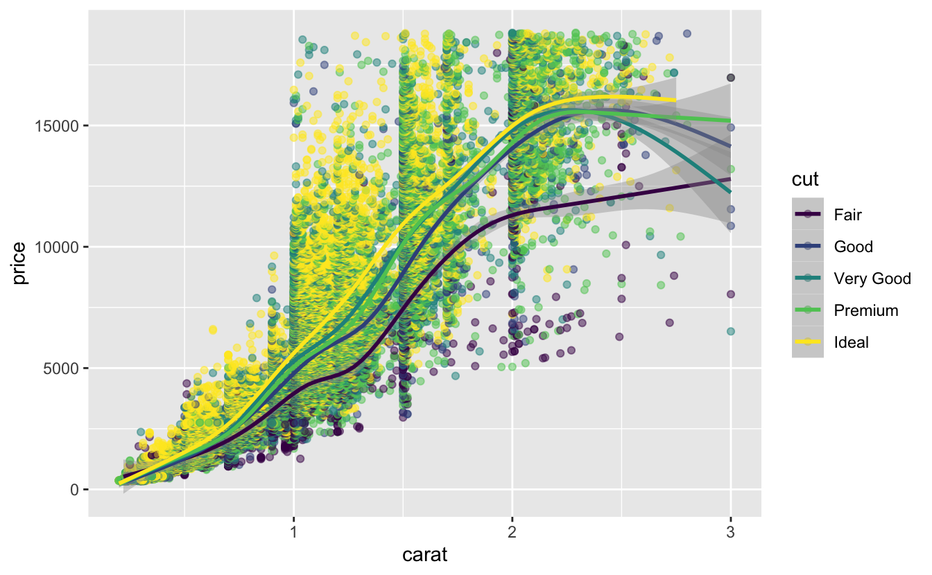
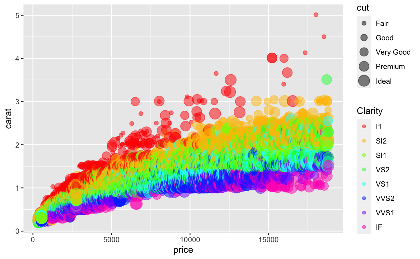
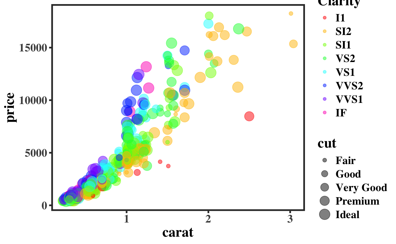
The slope evolution shows that in general, the better the cut, the higher the price. But there are some discrepancies that may be explained in another manner:
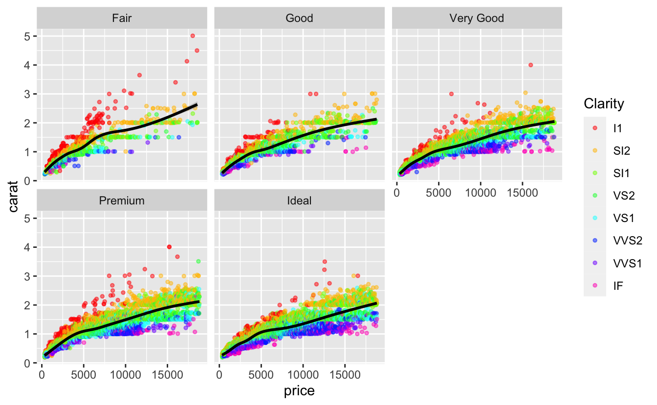
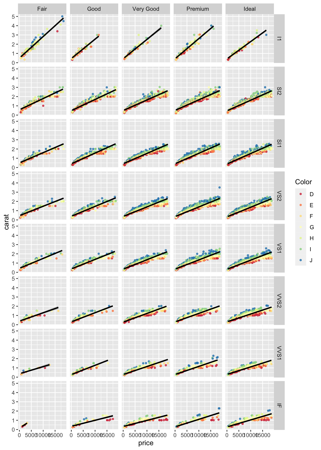
It is often easier to grasp a multi-variable problem by plotting all our data in a facet plot using facet_wrap(~variable1) if you want one variable changing in each plot:
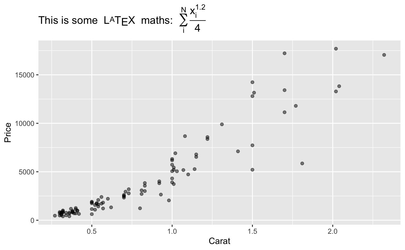
To write mathematical expressions, including subscripts/superscripts, or more complex mathematical formulas, the easiest way is to use \(\LaTeX\) expressions thanks to the latex2exp package. Just write your text within a latex2exp::TeX() function, and that is all. Since R 4.0, it is recommended to use the raw string literal syntax. The syntax looks like r"(...)", where ... can contain any character sequence, including \ (no need to escape the \ character).
Also, in case you have a variables to add in your string, it is often clearer/easier to use glue::glue() instead of paste() or paste0(). Then, you can combine the two, like so:
library(latex2exp)library(glue)A<-1.2B<-4diamonds|>sample_n(100)|>ggplot(aes(x =carat, y =price))+geom_point(alpha =0.5)+labs(x ="Carat", y ="Price", title =TeX(glue(r'(This is some $\,\LaTeX\,$ maths: $\,\sum_i^{N}\frac{x_i^{[A]}}{[B]}$)', .open ="[", .close ="]")))
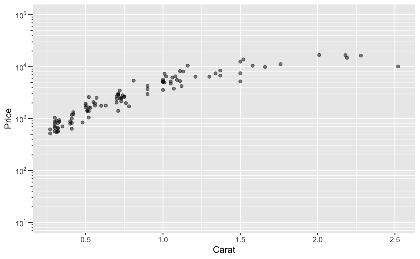
To transform the axis with a logarithmic scale, use the transform ="log10" option of the or scale_x(y)_continuous() functions. Here is an example:
breakslog10<-function(x){low<-floor(log10(min(x)))high<-ceiling(log10(max(x)))return(10^(seq(low, high)))}minorbreakslog10<-function(x){low<-floor(log10(min(x)))high<-ceiling(log10(max(x)))return(rep(1:9, length(low:high))*(10^rep(low:high, each =9)))}diamonds|>sample_n(100)|>ggplot(aes(x =carat, y =price))+geom_point(alpha =0.5)+labs(x ="Carat", y ="Price")+scale_y_continuous(# tweak the limits if you want limits =c(10,1e5),# transform the scale transform ="log10",# major breaks in powers of 10 breaks =breakslog10,# minor breaks (only useful for the grid) minor_breaks =minorbreakslog10,# write labels in scientific notation labels =scales::trans_format("log10", scales::math_format(10^.x)),# add logticks guide =guide_axis_logticks(long =2, mid =1, short =0.5))
11.2.4 Theming
It is very easy to keep the same theme on all your graphs thanks to the theme() function. There are a collection of pre-defined themes, like:
You can define all the parameters you want, like this (hit ?theme like usual to see all the parameters):
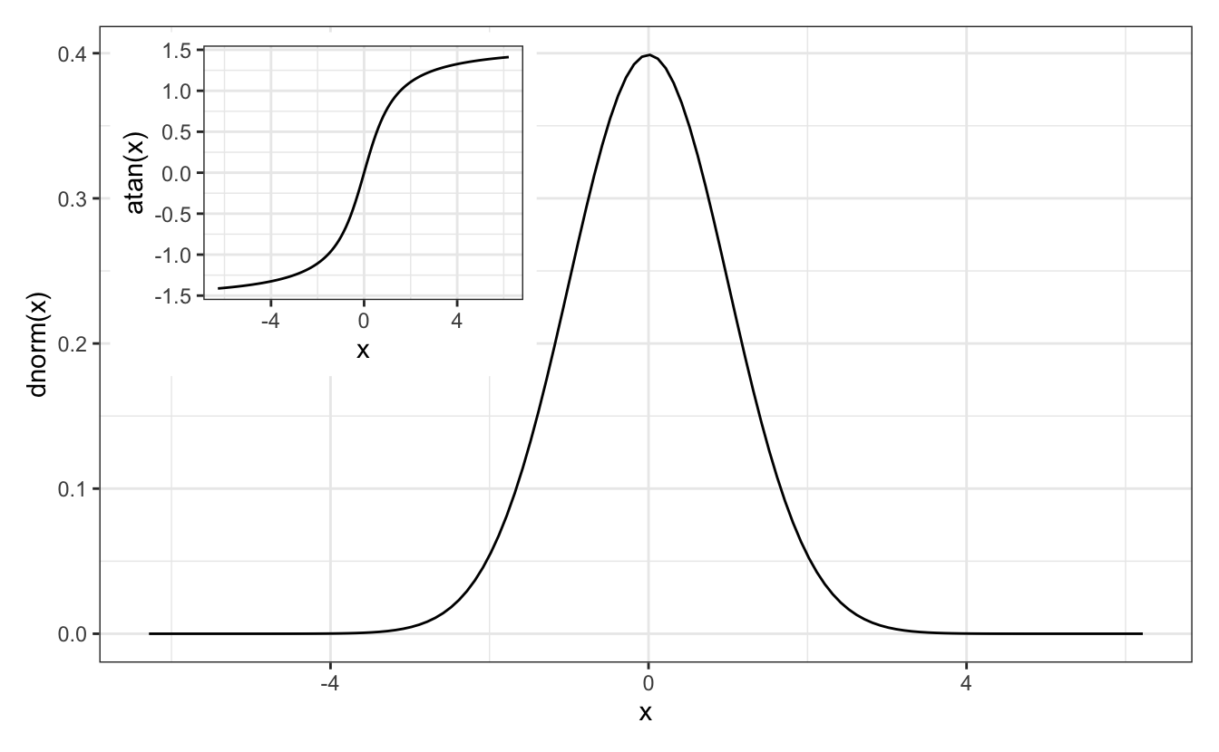
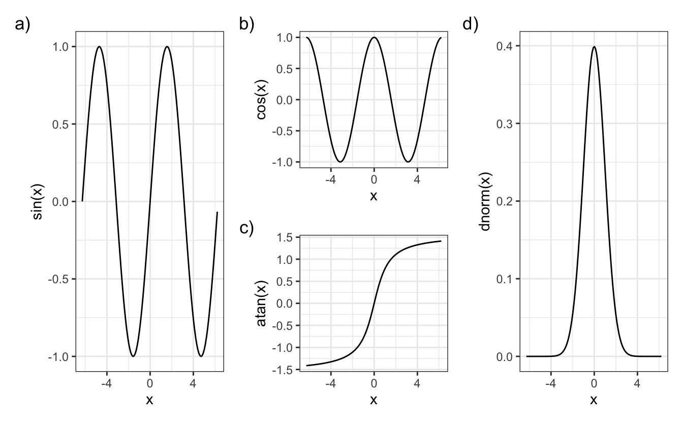
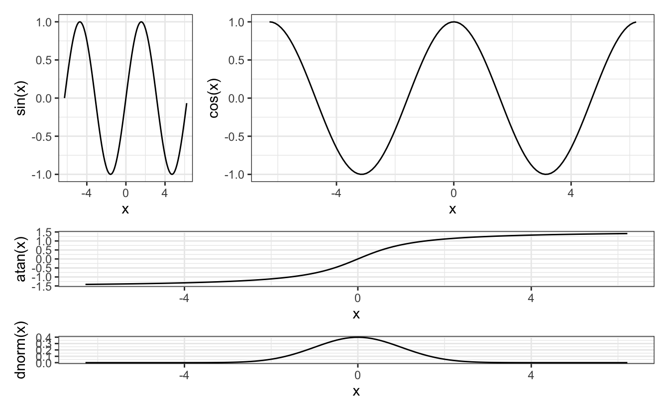
If you have several plot you want to gather on a grid and you can’t use facet_wrap() (because they come from different data sets), you can use the library patchwork:
If you want to make an inset plot, first make your plots, then add a plot within the other using patchwork::inset_element(), specifying the x and y positions of the 4 corners of the inset plot using relative values:
p4+inset_element(p3, left =0.01, right =.4, bottom =.45, top =.99)
11.3 Exporting a plot to pdf or png
11.3.1 A single plot
A plot can be exported if surrounded by XXX and dev.off(), with XXX that can be pdf("xxx.pdf",height=6, width=8), png("xxx.png",height=600, width=800)… Examples:
You can also export the graph as a .tex file using tikz(), which allows you to use \(\LaTeX\) mathematical expressions (don’t forget to escape the \ character or to use raw string literal syntax r"(...)"):
library(tikzDevice)tikz("plot.tex",height=6, width=8, pointsize =10, standAlone=TRUE)plot(x,y, type="l", xlab=r"($\omega_i$)")dev.off()tools::texi2pdf("plot.tex")# compile the tex file to pdfsystem("open -a Skim plot.pdf")# on Mac: open the resulting pdf with Skim
Pro Tip: make a plot_to_pdf() function
Here is a function I use to save my plots as pdf using tikzDevice:
#' plot_to_pdf()#'#' Saves a ggplot to pdf through a tikzDevice#'#' @param P A ggplot plot.#' @param filename A file name if pdf export wanted in the folder "Plots".#' @param out.folder The folder where the pdf will be saved.#' @param H Height of the exported plot#' @param W Width of the exported plot#' @param open logical. Open the file once created?plot_to_pdf<-function(P, filename="plot",out.folder=".",H=6, W=8, open=TRUE){# if tikzDevice is not loaded, load it and set the optionsif(!"tikzDevice"%in%(.packages())){library(tikzDevice)options(tikzLatexPackages =c(getOption("tikzLatexPackages"),r"(\usepackage{cmbright})", # for sans serif fontr"(\usepackage{bm})", # for bold mathsr"(\usepackage[utf8]{inputenc})",r"(\usepackage{wasysym})"))}tikz(paste0(filename, ".tex"), height =H, width =W, pointsize =10, standAlone =TRUE)print(P)dev.off()# compile the .tex file to pdftools::texi2pdf(paste0(filename, ".tex"))# move the pdf to the output folderfile.copy(from =paste0(filename, ".pdf"), to =paste0(out.folder, "/"))# clean compilation filestoremove<-list.files(pattern =filename)if(out.folder=="."){toremove<-toremove[!grepl(".pdf", toremove)]}file.remove(toremove)# open the pdf file with Skim (on Mac)if(open)system(paste0("open -a Skim ",out.folder,"/",filename,".pdf"))}
11.3.2 Multiple plots
In case you want to output multiple plots with a for loop, you have two options:
Ouptut a separate file for each plot
For pdf output only: ouptut a single file with a each plot in a different page
In both cases, if you plot with ggplot (which I always recommend), then you need to explicitly print() the plot in the for loop, like so:
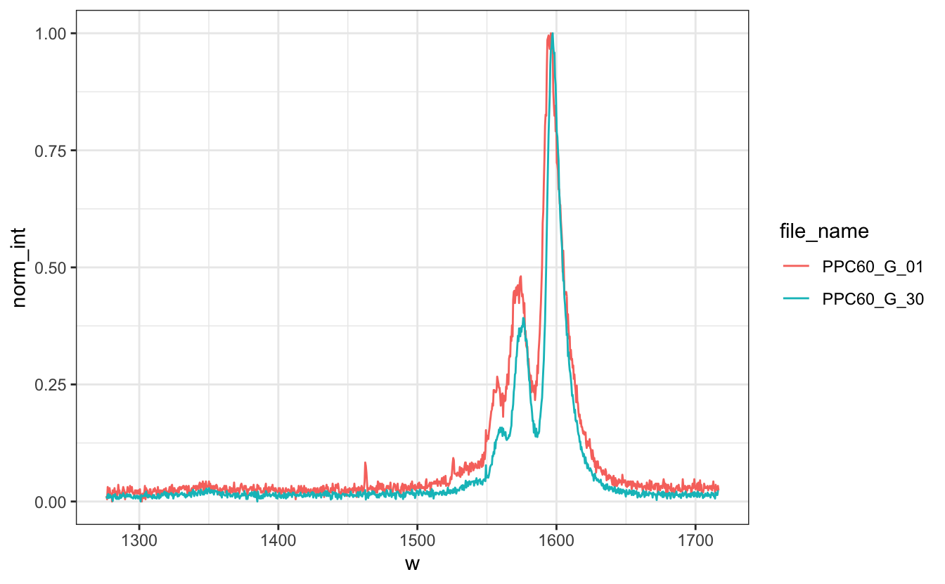
Gather the two data.frame in another single tidy one: it should have three columns, w, Intensity and file_name
Create a function norm01() that, given a vector, returns the same vector normalized to [0,1]
Using group_by() and mutate(), add a column norm_int of normalized intensity for each file
Plot the two normalized spectra on the same graph using lines of different colors
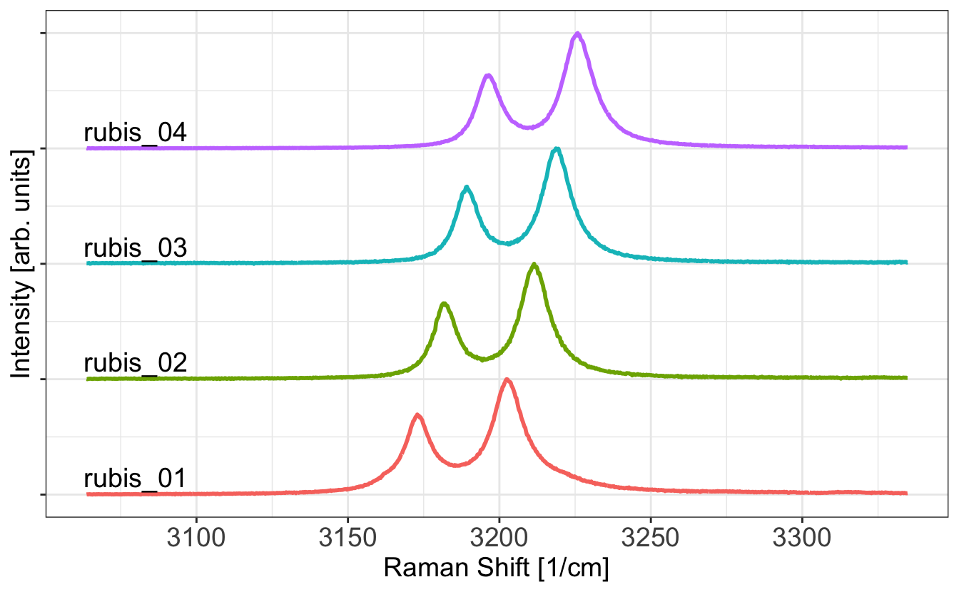
Play with the theme and parameters to reproduce the following plot:
Solution
# Load them in two separate `tibbles`library(tidyverse)# Using read.table (who returns a data.frame)df1<-read.table("Data/PPC60_G_01.txt", col.names=c("w","Intensity"))df2<-read.table("Data/PPC60_G_30.txt", col.names=c("w","Intensity"))df1<-tibble(df1)# make a tibble from a data.framedf2<-tibble(df2)# Direct version using tidyverse (read_table returns a tibble)df1<-read_table("Data/PPC60_G_01.txt", col_names=c("w","Intensity"))df2<-read_table("Data/PPC60_G_30.txt", col_names=c("w","Intensity"))# Gather the two `tibbles` in another single tidy one: # it should have three columns, `w`, `Intensity` and `file_name`df1$file_name<-"PPC60_G_01"# add the "file_name" columndf2$file_name<-"PPC60_G_30"df_tidy<-bind_rows(df1,df2)# stack the two tibbles# Create a function `norm01` that, given a vector, returns the same vector normalized to [0,1]norm01<-function(x){(x-min(x))/(max(x)-min(x))}# Using `group_by` and `mutate`, add a column `norm_int` in df_tidy of normalized intensity for each filedf_tidy<-df_tidy|>group_by(file_name)|>mutate(norm_int=norm01(Intensity))# Plot the two normalized spectra on the same graph using lines of different colorslibrary(ggplot2)df_tidy|>ggplot(aes(x=w, y=norm_int, color=file_name))+geom_line()+theme_bw()
# Play with the theme and parameters to reproduce the following plot:df_tidy|>ggplot(aes(x=w, y=norm_int, color=file_name))+geom_line()+scale_color_manual(values=c("red","royalblue"), name="")+labs(x="Raman Shift [1/cm]", y="Intensity [arb. unit]")+theme_bw()+theme(legend.position ="top", text =element_text(size =14,family ="Times"), panel.grid.major =element_blank(), panel.grid.minor =element_blank())
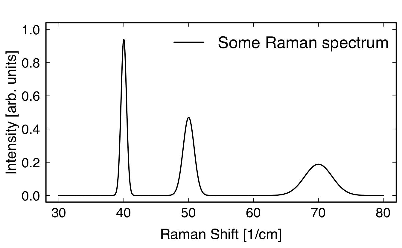
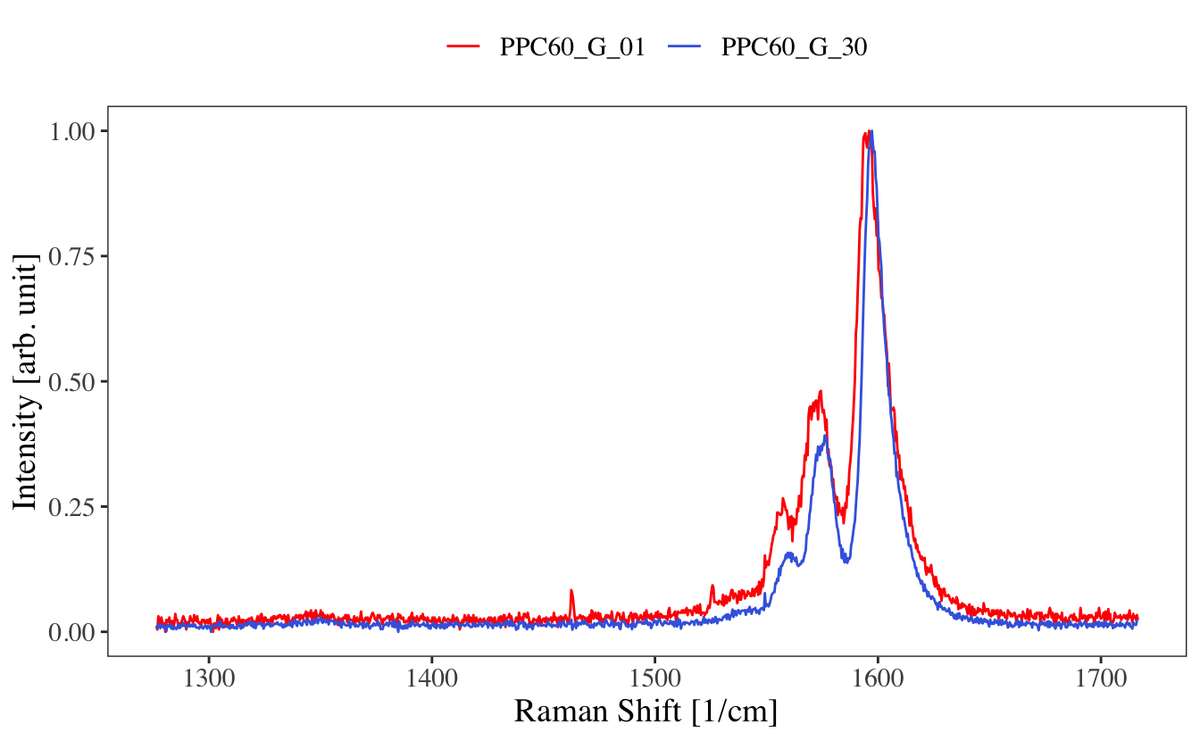
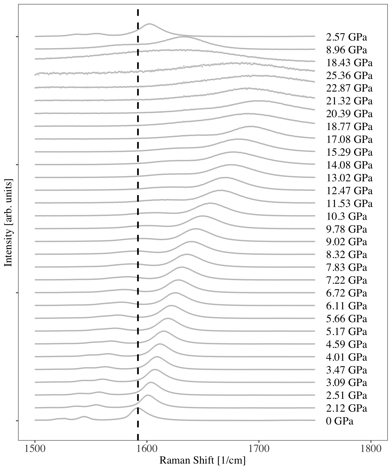
Make a plot similar to this one (don’t bother with the fit), plotting the evolution of a Raman spectrum as a function of pressure:
Bonus:
Looking at data for increasing pressures
Plot the data using an interactive slider (see about the frame option here)
Plot the data using a 3D color map. Since the data are not on a regular grid, you will need to interpolate the data on a regular grid with the akima package and its interp() function. See chapter @ref(colorplots) on 3D plotting for help.
Solution
# get the list of files for the ramps up and down and out of cellfiles_up<-list.files("Data/dataG/", pattern="up")files_down<-list.files("Data/dataG/", pattern="down")out_cell<-list.files("Data/dataG/", pattern="out")# store all file names in the correct orderallfiles<-c(out_cell, files_up, files_down)# load the wanted packagelibrary(tidyverse)library(ggplot2)# create the norm01 functionnorm01<-function(x){(x-min(x))/(max(x)-min(x))}# initialize an empty tibble to store all dataalldata<-tibble()for(fileinallfiles){#file <- allfiles[1]# read the data and stor it in dd<-read_table(paste0("Data/dataG/",file), col_names=TRUE)# normalize datad$Int_n<-norm01(d$Int)# store file named$name<-file# store run number for the stackingd$run_number<-which(file==allfiles)# store all data in a single tidy tibblealldata<-bind_rows(alldata, d)}# plot all dataalldata|>filter(w<=1750, w>=1500)|># zoom on the interesting partggplot(aes(x=w, y=Int_n+run_number-1))+# to stack the plotsgeom_point(color="gray", alpha=.5, size=.2)+#plot data with pointsxlim(c(1500,1800))+#add some white space on the right to write the pressuregeom_vline(xintercept=1592, lty=2, size=1)+#show a vertical lineannotate(geom ="text", size=5, #show the pressure values x =1760, y=seq_along(allfiles)-1, hjust =0, label =paste(unique(alldata$P),"GPa"), family ="Times")+labs(x="Raman Shift [1/cm]", #have the good axis labels y="Intensity [arb. units]")+theme_bw()+#black and white themetheme(legend.position ="none",#no legend text =element_text(size =14, family ="Times"),#text in font Times axis.text.y =element_blank(),# no y axis values axis.text =element_text(size =14), panel.grid.major =element_blank(), # no grid panel.grid.minor =element_blank())
# Looking at data for increasing pressures, plot the data using an interactive sliderlibrary(plotly)P<-alldata|>filter(grepl("up",name))|># only increasing pressuresfilter(w<=1850, w>=1500)|># zoom on the interesting partggplot(aes(x=w, y=Int_n, frame=P))+# each pressure in a new framegeom_point(color="gray", alpha=.5, size=1)+#plot data with pointslabs(x="Raman Shift [1/cm]", #have the good axis labels y="Intensity [arb. units]")+theme_bw()+#black and white themetheme(legend.position ="none",#no legend text =element_text(size =14, family ="Times"), axis.text =element_text(size =14), panel.grid.major =element_blank(), # no grid panel.grid.minor =element_blank())ggplotly(P, dynamicTicks =TRUE)
# Plot the data using a 3D color map. Since the data are not on a regular grid, # you will need to interpolate the data on a regular grid # with the `akima` package and its `interp()` functionlibrary(akima)toplot<-alldata|>filter(grepl("up",name))|>filter(w<=1850, w>=1500)toplot.interp<-with(toplot, interp(x =w, y =P, z =Int_n, duplicate="median", xo=seq(min(toplot$w), max(toplot$w), length =100), yo=seq(min(toplot$P), max(toplot$P), length =100), extrap=FALSE, linear=FALSE))# toplot.interp is a list of 2 vectors and a matrixstr(toplot.interp)
#> List of 3
#>  $ x: num [1:100] 1500 1504 1507 1511 1514 ...
#>  $ y: num [1:100] 2.12 2.35 2.59 2.82 3.06 ...
#>  $ z: num [1:100, 1:100] NA NA NA 0.0287 0.0291 ...
# Regrouping this list to a 3-columns data.framemelt_x<-rep(toplot.interp$x, times=length(toplot.interp$y))melt_y<-rep(toplot.interp$y, each=length(toplot.interp$x))melt_z<-as.vector(toplot.interp$z)toplot.smooth<-na.omit(data.frame(w=melt_x, Pressure=melt_y, Intensity=melt_z))# Plottingcolors<-colorRampPalette(c("white","royalblue","seagreen","orange","red","brown"))(500)P<-ggplot(data=toplot.smooth, aes(x=w, y=Pressure, fill=Intensity))+geom_raster()+scale_fill_gradientn(colors=colors, name="Normalized\nIntensity\n[arb. units]")+labs(x ="Raman Shift [1/cm]",y="Pressure [GPa]")+theme_bw()+theme(text =element_text(size =14, family ="Times"), axis.text =element_text(size =14), panel.grid.major =element_blank(), # no grid panel.grid.minor =element_blank())ggplotly(P, dynamicTicks =TRUE)
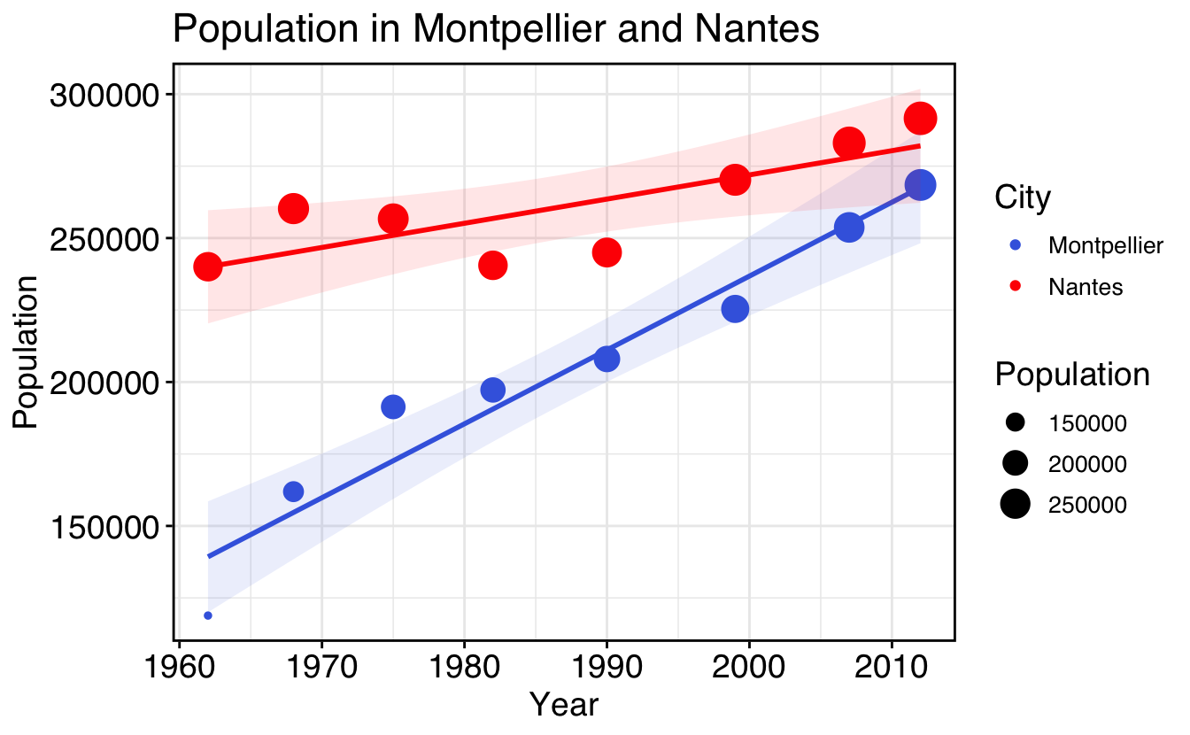
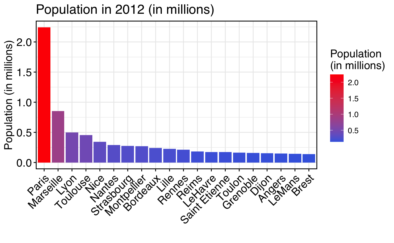
Plot the population vs. year with a color for each city
With points
With lines
With a black and white theme
Make it interactive
Try reproducing the following plots (Google is your friend) (look into the function reorder() and this help to use it with facets):
Solution
# Load and tidy population data.framelibrary(tidyverse)df<-read.csv("Data/population.csv")df<-pivot_longer(df, cols=-year, #year should stay a column names_to="City", #column names should go to the column `city` values_to="Population"#values should go to the column `population`)df$City<-gsub("\\.", " ", df$City)# replace dots by spaces in city names# Plot the population vs. year with a different color for each cityp<-ggplot(data=df, aes(x=year, y=Population, color=City))# With pointsp+geom_point()# With linesp+geom_line()# With a black and white theme# Change the axis labels to "year" and "Population"p<-p+geom_line()+theme_bw(); p# Make it interactivelibrary(plotly)ggplotly(p, dynamicTicks =TRUE)# Reproduce the plotsmy_theme<-theme_bw()+theme(axis.text =element_text(size =14,family ="Helvetica",colour="black"), text =element_text(size =14,family ="Helvetica"), axis.ticks =element_line(colour ="black"), legend.text =element_text(size =10,family ="Helvetica",colour="black"), panel.border =element_rect(colour ="black", fill=NA, linewidth=1))colors<-c("royalblue","red")p1<-df|>filter(City%in%c("Montpellier","Nantes"))|>ggplot(aes(x=year, y=Population, size=Population, color=City))+geom_point()+geom_smooth(method="lm", aes(fill=City), alpha=0.1, show.legend =FALSE)+scale_color_manual(values=colors)+scale_fill_manual(values=colors)+ggtitle("Population in Montpellier and Nantes")+labs(x="Year", y="Population")+my_themep1p2<-df|>filter(year==2012)|>ggplot(aes(x=reorder(City,-Population), y=Population/1e6, fill=Population/1e6))+geom_bar(stat="identity", position="dodge")+ggtitle("Population in 2012 (in millions)")+labs(x="", y="Population (in millions)")+scale_fill_gradientn(colors=colors, name="Population\n(in millions)")+my_theme+theme(axis.text.x =element_text(angle =45, hjust=1))p2
Source Code
# Plotting**Now that we have seen most of the basics, let's start the fun stuff !**There are two main ways to plot data in R:- Using base graphics, the native R plotting device- Using the package `ggplot2` and tidy data frames`ggplot2` is extremely powerful and some people advise not even teaching base graphics to beginners. But I find that some times it's just quicker/easier with base graphics, so I will still present it, although not in full details.## Base graphics### Basic plotting```{r, warnings=FALSE}x <- seq(-3*pi,3*pi,length=50)y <- sin(x)z <- sin(x)^2df <- data.frame(x=x, y=y)plot(x,y) # plot providing x and y dataplot(df) # plot providing a two-columns data.frameplot(df, type="l")plot(df, type="b")df <- data.frame(x=x, y=y, z=z, w=z*y)plot(df) # plot providing a multi-columns data.frame```### Adding some styleOK, easy. Now let's do some tuning of this, because it's a tad ugly...Type in each command and see what they do.```{r, warnings=FALSE}# create some fake datax <- seq(-3*pi,3*pi,length=100)df <- data.frame(x=x, y=sin(x), z=sin(x)^2)# add some styling parameterspar(family = "Helvetica", cex.lab=1.5, cex.axis=1.4, mgp = c(2.4, .5, 0), tck=0.02, mar=c(4, 4, 2, .5), lwd=2, las=1)plot(df$x,df$y, type = "l", # "l" for lines, "p" for points xlab = "X values", ylab = "Intensity", axes = FALSE, main = "Some Plot", ylim = c(-1,2) )# vertical line in 0abline(v=0,lty=2,lwd=2)# horizontal line in 0abline(h=0,lty=3,lwd=2)# line with coefficients a (intercept) and b (slope)abline(a=0,b=.1,lty=4,lwd=1)# add a linelines(df$x,df$z,type = "l",col="red",lwd=3)# add pointspoints(df$x,df$z*df$y,col="royalblue",pch=16,cex=1)# add custom axis. # Default with axis(1);axis(2);axis(3, labels=FALSE);axis(4, labels=FALSE);# Bottomaxis(1,at=seq(-10,10,2),labels=TRUE,tck=0.02)axis(1,at=seq(-10,10,1),labels=FALSE,tck=0.01); # small inter-ticks# Topaxis(3,at=seq(-10,10,2),labels=FALSE)axis(3,at=seq(-10,10,1),labels=FALSE,tck=0.01); # small inter-ticks# Leftaxis(2,at=seq(-1,2,.5),labels=TRUE)axis(2,at=seq(-1,2,.25),labels=FALSE,tck=0.01); # small inter-ticks# Rightaxis(4,at=seq(-1,2,.5),labels=FALSE)axis(4,at=seq(-1,2,.25),labels=FALSE,tck=0.01); # small inter-ticks# Draw a boxbox()# Print legendlegend("topleft", cex=1.4, #size of text lty=c(1,1,NA), # type of line (1 is full, 2 is dashed...) lwd=c(1,3,NA), # line width pch=c(NA,NA,16), # type of points col=c("black","red","royalblue"), # color bty = "n", # no box around legend legend=c("sin(x)",expression("sin(x)"^2),expression("sin(x)"^3)) )```Most needs should be covered with this simple plot that can be adapted.:::{.callout-note collapse="true"}## Pro Tip: make a _code snippet_Go to Rstudio **Preferences**, **Code**, **Edit code snippets**, and add the following lines:```rsnippet plot#pdf("xxx.pdf", height=6, width=8)par(cex.lab=1.7, cex.axis=1.7, mgp =c(3, 0.9, 0), tck=0.02, mar=c(4.5, 4.5, 1, 1), lwd =3, las=1)plot(${1:x},${2:y},type="l", # plot with a lineylim=c( , ),xlim=c( , ),lwd=2, # width of the linelty=1, # type of lineaxes=FALSE, # do not show axesxlab="${1:x}", # x labelylab="${2:y}", # y labelmain="") # Titlelegend("topright",cex=1.5, # size of the textpch=c(), # list of point typeslty=c(), # list of line typeslwd=c(), # list of line widthscol=c(), # list of line colorsbty="n", # no box around the legendlegend=c() # list of legend labels )# Draw axes with minor ticksaxis(1, at=seq(0,1,.2), labels=TRUE)axis(1, at=seq(0,1,.1), labels=FALSE, tck=0.01)axis(3, at=seq(0,1,.2), labels=FALSE)axis(3, at=seq(0,1,.1), labels=FALSE, tck=0.01)par(mgp =c(2.5, 0.2, 0))axis(2, at=seq(0,10,1), labels=TRUE)axis(2, at=seq(0,10,.5), labels=FALSE, tck=0.01)axis(4, at=seq(0,10,1), labels=FALSE)axis(4, at=seq(0,10,.5), labels=FALSE, tck=0.01)box() # drow box around plot#dev.off()```::::::{.callout-note collapse="true"}## Going further#### Panel plotsLets create a plot with different panels (a bit ugly without styling, you need to tweak the margins and text distance to plot with `par(mar(), mgp())`{.R} before each plot):```{r, fig.height=6, fig.width=6}# some fake datax <- seq(-10,10,1)d1 <- data.frame(x=x, y=sin(x))d2 <- data.frame(x=x, y=cos(x))d3 <- data.frame(x=x, y=exp(-x^2)*sin(x)^2)# on a simple grid, use:# par(mfrow=c(nrows, ncols))par(mfrow=c(1, 3), mar=c(4,4,1,1))plot(d1,type="l")plot(d2,type="p")plot(d3,type="b")``````{r, fig.height=6, fig.width=6}# creating the layout and stylingM <- matrix(c(c(1,1),c(2,3)), byrow=TRUE, ncol=2); Mnf <- layout(M, heights=c(1), widths=c(1))# first plotplot(d1,type="l")# second plotplot(d2,type="p")# third plotplot(d3,type="b")``````{r, fig.height=6, fig.width=6}# creating the layout and stylingM <- matrix(c(c(1,1),c(2,3)), byrow=FALSE, ncol=2); Mnf <- layout(M, heights=c(1), widths=c(1))# first plotplot(d1,type="l")# second plotplot(d2,type="p")# third plotplot(d3,type="b")```#### Barplots and densities```{r, warnings=FALSE}x <- rnorm(1e4, mean = 0, sd = 1)# Barplothist(x)# Densityy <- density(x, bw=0.1) # small kernel bandwidthy2 <- density(x, bw=0.5) # larger kernel bandwidthplot(y, lwd=2, main="", xlab="X values", xlim=c(-4,4))lines(y2,col="red",lwd=2)points(x, jitter(rep(.01,length(x)), amount=.01), cex=1,pch=16, col=adjustcolor("royalblue", alpha=.01))```:::<details> <summary>**Exercise**</summary>Try reproducing these plots:```{r, echo=FALSE}Gaussian <- function(x,x0,FWHM,A=1,y0=0){ y0 + 2.*A*sqrt(2*log(2))/sqrt(2*pi)/FWHM*exp(-(x-x0)^2*4*log(2)/FWHM^2)}par(family = "Helvetica", cex.lab=1.5, cex.axis=1.4, mgp = c(2.4, .5, 0), tck=0.02, mar=c(4, 4, 2, .5), lwd=2, las=1)x <- seq(-10,10,.5)plot(x,sin(x),type="b")plot(x,sin(x),type="l", lwd=5, lty=2)points(x,sin(x),cex=3, col="blue", pch=2)abline(h=0, col="red")x <- seq(30,80,.01)plot(x, Gaussian(x,40,1)+Gaussian(x,50,2)+Gaussian(x,70,5), type="l", ylim=c(0,1), xlab="Raman Shift [1/cm]", ylab="Intensity [arb. units]", lwd=2)legend("topright", cex=1.7, lty=c(1), lwd=c(2), col=c("black"), bty = "n", legend=c("Some Raman spectrum") )axis(3, labels=FALSE)axis(4, labels=FALSE)```</details>## Advanced plotting using ggplot2Further reading [here](https://ggplot2-book.org/introduction.html) and on the [cheatsheet](https://raw.githubusercontent.com/rstudio/cheatsheets/main/data-visualization.pdf) for example.`ggplot2` is a package (now even available for python) that completely changes the methodology of plotting data. With `ggplot2`, data are gathered in a **tidy** `data.frame`{.R}, and each column can be used as a parameter to tweak colors, point size, etc.First things first, load the library :```{r, message=FALSE, warnings=FALSE}library(ggplot2)```Actually, `ggplot2` is attached to `tidyverse` so a simple:```{r, message=FALSE, warnings=FALSE}library(tidyverse)```is enough, as it will load `ggplot2` and most of the useful data manipulation libraries.### The grammar of graphicsWith `ggplot2` is introduced the notion of "grammar of graphics" through the function `ggplot()`{.R}. What it means is that the plots are built through independent blocks that can be combined to create any wanted graphical display.To construct a plot, you need to provide building blocks such as:- data gathered in a *tidy* data.frame- an *aesthetics* mapping: what column is *x*, *y*, the color, the size, etc...- geometric object: point, line, bar, histogram, tile...- statistical transformations if needed- scales: color_manual, x_continuous, ...- coordinate system- faceting: wrap, grid- theme: theme_bw(), theme_light()...The typical call to `ggplot()`{.R} is thus (the arguments between `<>` are yours to specify):```rggplot(data=<data>, aes(x=<x>, y=<y>, color=<z>, size=<w>))+ geom_<geometry>()+ scale_<scales>()+ facet_<facets>()+<theme>```Since a figure is worth a thousand words, let's get to it. We will use the dataset `diamonds` built-in with the `ggplot2` package. Let's have a look:```{r, warnings=FALSE}diamonds````diamonds` contains 53940 lines and 10 columns in a `tibble`{.R}. `ggplot2` can easily handle such large dataset.Let's say we want to see whether there is a correlation between price and weight (carat) of the diamonds.We will make a call to `ggplot()`{.R} by providing it the data and the `x` and `y` mapping:```{r, warnings=FALSE}p <- ggplot(data = diamonds, aes(x = carat,y = price))p```You see that our plot `p` here has the proper axis labels and range:```{r}glue::glue("carat {c('min','max')}: {range(diamonds$carat)}")glue::glue("price {c('min','max')}: {range(diamonds$price)}")```but it does not display any data points. For this we have to add a geometry to the plot, using one of the `geom_xx()`{.R} functions. Let's plot it using points for now:```{r, warnings=FALSE}p + geom_point()```OK, we're onto something, but we can probably add some information to this plot. We will first cut the data above 3 carats because they are not relevant, and add some transparency to the points to see some statistical information. Let's make use of the pipe operator `|>` to make this easily readable:```{r, warnings=FALSE}p <- diamonds |> filter(carat<=3) |> ggplot(aes(x = carat, y = price))p + geom_point(alpha=0.5)```Let's now see whether the type of cut plays a role here by coloring the points according to the `cut` variable:```{r, warnings=FALSE}p <- diamonds |> filter(carat<=3) |> ggplot(aes(x = carat, y = price, color = cut))p + geom_point(alpha=0.5)```It looks like the price dispersion is homogeneous, we can make sure by adding a spline smoothing:```{r, warning = FALSE, message=FALSE}p + geom_point(alpha=0.5) + geom_smooth()```The slope evolution shows that in general, the better the cut, the higher the price. But there are some discrepancies that may be explained in another manner:```{r, warnings=FALSE}p <- diamonds |> filter(carat<=3) |> ggplot(aes(x = carat, y = price, color = clarity))p + geom_point(alpha=0.5) + geom_smooth()```It is often easier to grasp a multi-variable problem by plotting all our data in a facet plot using `facet_wrap(~variable1)`{.R} if you want one variable changing in each plot:```{r, warning = FALSE, message=FALSE}colors <- rainbow(length(unique(diamonds$clarity)))p <- diamonds |> ggplot(aes(x = price, y = carat, color = clarity)) + geom_point(alpha = 0.5, size = 1) + geom_smooth(color = "black") + scale_colour_manual(values = colors, name = "Clarity") + facet_wrap(~cut) p```... or `facet_grid(y_variable ~ x_variable)`{.R} if you want to see one variable as a function of another:```{r, warning = FALSE, message=FALSE, fig.asp=1.4}p <- diamonds |> ggplot(aes(x = price, y = carat, color = color)) + geom_point(alpha = 0.8, size = 1) + geom_smooth(method = "lm", color = "black") + scale_colour_brewer(palette = "Spectral", name = "Color") + facet_grid(clarity ~ cut) p```Or by adding another graphical parameter such as the size of the points:```{r, warnings=FALSE}p <- diamonds |> ggplot(aes(x = price, y = carat, color = clarity, size = cut)) + geom_point(alpha = 0.5) + scale_colour_manual(values = colors, name = "Clarity")p```OK, maybe not here because the graph gets clogged, so we can lighten it by sampling data:```{r, warnings=FALSE}p <- diamonds |> sample_n(500) |> ggplot(aes(x = carat, y = price, color = clarity, size = cut)) + geom_point(alpha = 0.5) + scale_colour_manual(values = colors, name = "Clarity")p```### Writing maths in the plotTo write mathematical expressions, including subscripts/superscripts, or more complex mathematical formulas, the easiest way is to use $\LaTeX$ expressions thanks to the `latex2exp` package. Just write your text within a `latex2exp::TeX()`{.R} function, and that is all. Since R 4.0, it is recommended to use the raw string literal syntax. The syntax looks like `r"(...)"`, where `...` can contain any character sequence, including `\` (no need to escape the `\` character).Also, in case you have a variables to add in your string, it is often clearer/easier to use `glue::glue()`{.R} instead of `paste()`{.R} or `paste0()`{.R}. Then, you can combine the two, like so:```{r, echo=TRUE, warnings=FALSE}library(latex2exp)library(glue)A <- 1.2B <- 4diamonds |> sample_n(100) |> ggplot(aes(x = carat, y = price))+ geom_point(alpha = 0.5) + labs(x = "Carat", y = "Price", title = TeX(glue(r'(This is some $\,\LaTeX\,$ maths: $\,\sum_i^{N}\frac{x_i^{[A]}}{[B]}$)', .open = "[", .close = "]")) )```For more complicated stuff, I however advise to not use the `TeX()`{.R} function and write directly your text in $\LaTeX$, then [export your plot with `tikzDevice` as a .tex file and compile it to pdf](#a-single-plot).### Logarithmic scaleTo transform the axis with a logarithmic scale, use the `transform = "log10"`{.R} option of the or `scale_x(y)_continuous()`{.R} functions. Here is an example:```{r}breakslog10 <-function(x){ low <-floor(log10(min(x))) high <-ceiling(log10(max(x)))return(10^(seq(low, high)))}minorbreakslog10 <-function(x){ low <-floor(log10(min(x))) high <-ceiling(log10(max(x)))return(rep(1:9, length(low:high))*(10^rep(low:high, each =9)))}diamonds |>sample_n(100) |>ggplot(aes(x = carat, y = price))+geom_point(alpha =0.5) +labs(x ="Carat",y ="Price")+scale_y_continuous(# tweak the limits if you wantlimits =c(10,1e5),# transform the scaletransform ="log10",# major breaks in powers of 10breaks = breakslog10,# minor breaks (only useful for the grid)minor_breaks = minorbreakslog10,# write labels in scientific notationlabels = scales::trans_format("log10", scales::math_format(10^.x)),# add logticksguide =guide_axis_logticks(long =2, mid =1, short =0.5) )```### ThemingIt is very easy to keep the same theme on all your graphs thanks to the `theme()`{.R} function.There are a collection of pre-defined themes, like:```{r, include=FALSE}library(patchwork)``````{r, echo=FALSE, warnings=FALSE, fig.asp=1.4}((p + ggtitle("p + theme_grey() # the default") + theme_grey() + theme(legend.position = "none")) + (p + ggtitle("p + theme_classic()") + theme_classic() + theme(legend.position = "none"))) /((p + ggtitle("p + theme_bw()") + theme_bw() + theme(legend.position = "none")) + (p + ggtitle("p + theme_minimal()") + theme_minimal() + theme(legend.position = "none"))) /((p + ggtitle("p + theme_dark()") + theme_dark() + theme(legend.position = "none")) +(p + ggtitle("p + theme_light()") + theme_light() + theme(legend.position = "none")))```You can define all the parameters you want, like this (hit `?theme`{.R} like usual to see all the parameters):```{r, warnings=FALSE}my_theme <- theme_bw()+ theme(text = element_text(size = 18, family = "Times", face = "bold"), axis.ticks = element_line(linewidth = 1), legend.text = element_text(size = 14, family = "Times"), panel.border = element_rect(linewidth = 2), panel.grid.major = element_blank(), panel.grid.minor = element_blank() )p + my_theme```:::{.callout-note collapse="true"}## Pro Tip: make a _code snippet_Go to Rstudio **Preferences**, **Code**, **Edit code snippets**, and add the following lines:```rsnippet ggplot|>ggplot(aes(x=${1:x}, y=${2:y}, color=${3:z})) +geom_point() +labs(x ="X label", y ="Y label",color ="Color label") +theme_bw()```:::### Making interactive plots with ggplot2 and plotlyThanks to the `plotly` package, it is really easy to transform a `ggplot` plot into an interactive plot:```{r, include=FALSE, warning = FALSE, message=FALSE}library(plotly)``````r# load plotlylibrary(plotly)``````{r, warnings=FALSE}p <- diamonds |> sample_n(100) |> ggplot(aes(x = carat, y = price)) + geom_point(aes(color = clarity), alpha = 0.5, size = 2) + my_themeggplotly(p, dynamicTicks = TRUE)```### Gathering plots on a gridIf you have several plot you want to gather on a grid and you can't use `facet_wrap()`{.R} (because they come from different data sets), you can use the library [patchwork](https://patchwork.data-imaginist.com/articles/patchwork.html):```{r include=TRUE, warning = FALSE, message=FALSE, cache=FALSE}library(patchwork)library(ggplot2)theme_set(theme_bw())x <- seq(-2*pi,2*pi,.1)p1 <- qplot(x,sin(x), geom = "line")p2 <- qplot(x,cos(x), geom = "line")p3 <- qplot(x,atan(x), geom = "line")p4 <- qplot(x,dnorm(x), geom = "line")p1 + p2p1 + p2 / p3 + p4 + plot_annotation(tag_levels = 'a', tag_suffix=")")(p1 + p2 + plot_layout(widths = c(1,3))) /p3/p4 + plot_layout(heights = c(6, 2, 1))```### Plots with insetsIf you want to make an inset plot, first make your plots, then add a plot within the other using `patchwork::inset_element()`{.R}, specifying the x and y positions of the 4 corners of the inset plot using relative values:```{r include=TRUE, warning = FALSE, message=FALSE, cache=FALSE}p4 + inset_element(p3, left = 0.01, right = .4, bottom = .45, top = .99)```## Exporting a plot to pdf or png### A single plotA plot can be exported if surrounded by `XXX` and `dev.off()`{.R}, with `XXX` that can be `pdf("xxx.pdf",height=6, width=8)`{.R}, `png("xxx.png",height=600, width=800)`{.R}... Examples:```rP <-ggplot(df, aes(x,y)) +geom_point()pdf("plot.pdf",height=6, width=8)Pdev.off()``````rpdf("plot.png",height=600, width=800)plot(x,y,type="l",xlab="x" )dev.off()```You can also export the graph as a `.tex` file using `tikz()`{.R}, which allows you to use $\LaTeX$ mathematical expressions (don't forget to escape the `\` character or to use raw string literal syntax `r"(...)"`):```rlibrary(tikzDevice)tikz("plot.tex",height=6, width=8, pointsize =10, standAlone=TRUE)plot(x,y,type="l",xlab=r"($\omega_i$)" )dev.off()tools::texi2pdf("plot.tex") # compile the tex file to pdfsystem("open -a Skim plot.pdf") # on Mac: open the resulting pdf with Skim```:::{.callout-note collapse="true"}## Pro Tip: make a `plot_to_pdf()`{.R} functionHere is a function I use to save my plots as pdf using `tikzDevice`:```r#' plot_to_pdf()#'#' Saves a ggplot to pdf through a tikzDevice#'#' @param P A ggplot plot.#' @param filename A file name if pdf export wanted in the folder "Plots".#' @param out.folder The folder where the pdf will be saved.#' @param H Height of the exported plot#' @param W Width of the exported plot#' @param open logical. Open the file once created?plot_to_pdf <-function(P, filename="plot",out.folder=".",H=6, W=8, open=TRUE) {# if tikzDevice is not loaded, load it and set the optionsif (!"tikzDevice"%in%(.packages())) {library(tikzDevice)options(tikzLatexPackages =c(getOption( "tikzLatexPackages" ), r"(\usepackage{cmbright})", # for sans serif font r"(\usepackage{bm})", # for bold maths r"(\usepackage[utf8]{inputenc})", r"(\usepackage{wasysym})") ) }tikz(paste0(filename, ".tex"), height = H, width = W, pointsize =10, standAlone =TRUE)print(P)dev.off()# compile the .tex file to pdf tools::texi2pdf(paste0(filename, ".tex"))# move the pdf to the output folderfile.copy(from =paste0(filename, ".pdf"), to =paste0(out.folder, "/"))# clean compilation files toremove <-list.files(pattern = filename)if(out.folder =="."){ toremove <- toremove[!grepl(".pdf", toremove)] }file.remove(toremove)# open the pdf file with Skim (on Mac)if (open) system(paste0("open -a Skim ",out.folder,"/",filename,".pdf"))}```:::### Multiple plotsIn case you want to output multiple plots with a for loop, you have two options: 1. Ouptut a separate file for each plot2. For pdf output only: ouptut a single file with a each plot in a different page In both cases, if you plot with `ggplot` (which I always recommend), then you need to explicitly `print()` the plot in the for loop, like so:- Output a separate file for each plot:```rfor(i in1:4){ plot_name =paste0("plot_",i,".pdf") P <-ggplot(my_data[[i]], aes(x, y)) +geom_point()pdf(plot_name, height =6, width =8)print(P)dev.off()}```- Output a single file with a page for each plot:```rpdf("plots.pdf", height =6, width =8)for(i in1:4){ P <-ggplot(my_data[[i]], aes(x, y)) +geom_point()print(P)}dev.off()```## Further reading- [The R graph gallery](https://r-graph-gallery.com/)- A **must read**: [caveats](https://www.data-to-viz.com/caveats.html)- Color palettes and themes: - `RColorBrewer` palettes: `RColorBrewer::display.brewer.all()`{.R} - [ggtheme](https://jrnold.github.io/ggthemes/index.html) - [ggtheme color palettes](https://jrnold.github.io/ggthemes/reference/index.html#color-shape-and-linetype-palettes) - [hrbrthemes](https://github.com/hrbrmstr/hrbrthemes) - [Colour picker](https://github.com/daattali/colourpicker)- [Tuning manually the legend](https://aosmith.rbind.io/2020/07/09/ggplot2-override-aes/)## Exercises {#exo-plots}Download the exercises and solutions from the following repositories, then create a Rstudio project from the unzipped folder:- [Beginner exercises](https://github.com/colinbousige/R1-beginner)- [Advanced exercises](https://github.com/colinbousige/R2-advanced)- [GGplot2 exercises](https://github.com/colinbousige/R3-ggplot2)<details> <summary>**Exercise 1**</summary>- Download the two sample Raman spectra: <a href="Data/PPC60_G_01.txt" download target="_blank">PPC60_G_01.txt</a> and <a href="Data/PPC60_G_30.txt" download target="_blank">PPC60_G_30.txt</a>- Load them in two separate `tibble`{.R}- Gather the two `data.frame`{.R} in another single tidy one: it should have three columns, `w`, `Intensity` and `file_name`- Create a function `norm01()`{.R} that, given a vector, returns the same vector normalized to [0,1]- Using `group_by()`{.R} and `mutate()`{.R}, add a column `norm_int` of normalized intensity for each file- Plot the two normalized spectra on the same graph using lines of different colors- Play with the theme and parameters to reproduce the following plot:```{r, echo=FALSE, message=FALSE}# Load them in two separate `tibbles`library(tidyverse)# Using read.table (who returns a data.frame)df1 <- read.table("Data/PPC60_G_01.txt", col.names=c("w","Intensity"))df2 <- read.table("Data/PPC60_G_30.txt", col.names=c("w","Intensity"))df1 <- tibble(df1) # make a tibble from a data.framedf2 <- tibble(df2)# Direct version using tidyverse (read_table returns a tibble)df1 <- read_table("Data/PPC60_G_01.txt", col_names=c("w","Intensity"))df2 <- read_table("Data/PPC60_G_30.txt", col_names=c("w","Intensity"))# Gather the two `tibbles` in another single tidy one: # it should have three columns, `w`, `Intensity` and `file_name`df1$file_name <- "PPC60_G_01" # add the "file_name" columndf2$file_name <- "PPC60_G_30"df_tidy <- bind_rows(df1,df2) # stack the two tibbles# Create a function `norm01` that, given a vector, returns the same vector normalized to [0,1]norm01 <- function(x) { (x-min(x))/(max(x)-min(x))}# Using `group_by` and `mutate`, add a column `norm_int` in df_tidy of normalized intensity for each filedf_tidy <- df_tidy |> group_by(file_name) |> mutate(norm_int=norm01(Intensity))# Plot the two normalized spectra on the same graph using lines of different colors# Play with the theme and parameters to reproduce the following plot:df_tidy |> ggplot(aes(x=w, y=norm_int, color=file_name)) + geom_line()+ scale_color_manual(values=c("red","royalblue"), name="") + labs(x="Raman Shift [1/cm]", y="Intensity [arb. unit]") + theme_bw() + theme(legend.position = "top", text = element_text(size = 14,family = "Times"), panel.grid.major = element_blank(), panel.grid.minor = element_blank())```<details> <summary>Solution</summary>```{r, message=FALSE}# Load them in two separate `tibbles`library(tidyverse)# Using read.table (who returns a data.frame)df1 <- read.table("Data/PPC60_G_01.txt", col.names=c("w","Intensity"))df2 <- read.table("Data/PPC60_G_30.txt", col.names=c("w","Intensity"))df1 <- tibble(df1) # make a tibble from a data.framedf2 <- tibble(df2)# Direct version using tidyverse (read_table returns a tibble)df1 <- read_table("Data/PPC60_G_01.txt", col_names=c("w","Intensity"))df2 <- read_table("Data/PPC60_G_30.txt", col_names=c("w","Intensity"))# Gather the two `tibbles` in another single tidy one: # it should have three columns, `w`, `Intensity` and `file_name`df1$file_name <- "PPC60_G_01" # add the "file_name" columndf2$file_name <- "PPC60_G_30"df_tidy <- bind_rows(df1,df2) # stack the two tibbles# Create a function `norm01` that, given a vector, returns the same vector normalized to [0,1]norm01 <- function(x) { (x-min(x))/(max(x)-min(x))}# Using `group_by` and `mutate`, add a column `norm_int` in df_tidy of normalized intensity for each filedf_tidy <- df_tidy |> group_by(file_name) |> mutate(norm_int=norm01(Intensity))# Plot the two normalized spectra on the same graph using lines of different colorslibrary(ggplot2)df_tidy |> ggplot(aes(x=w, y=norm_int, color=file_name))+ geom_line()+ theme_bw()# Play with the theme and parameters to reproduce the following plot:df_tidy |> ggplot(aes(x=w, y=norm_int, color=file_name)) + geom_line()+ scale_color_manual(values=c("red","royalblue"), name="") + labs(x="Raman Shift [1/cm]", y="Intensity [arb. unit]") + theme_bw() + theme(legend.position = "top", text = element_text(size = 14,family = "Times"), panel.grid.major = element_blank(), panel.grid.minor = element_blank())```</details></details><details> <summary>**Exercise 2**</summary>- Download <a href="Data/rubis_01.txt" download target="_blank">rubis_01.txt</a>, <a href="Data/rubis_02.txt" download target="_blank">rubis_02.txt</a>, <a href="Data/rubis_03.txt" download target="_blank">rubis_03.txt</a> and <a href="Data/rubis_04.txt" download target="_blank">rubis_04.txt</a> and load them into a tidy `tibble`{.R}.- Normalize all data to [0,1] in a 4th column- Plot the 4 spectra on top of each other with a vertical shift of 1, with a different color for each spectrum + For this, check out the `factor()`{.R} function:```{r include=TRUE, warning = FALSE, message=FALSE, cache=FALSE}x <- c("a","a","b","c","a")factor(x)as.numeric(factor(x))```- Annotate on the base line with the name of the file. For this, use `annotate("text", x, y, label)`{.R}- It should look like this:```{r, echo=FALSE, warnings=FALSE, message=FALSE}library(tidyverse)library(ggplot2)df <- tibble()for (i in 1:4) { d <- read_table(paste("Data/rubis_0",i,".txt", sep=""), col_names=c("w", "Int")) d$Int_n <- norm01(d$Int) d$name <- paste0("rubis_0",i) df <- bind_rows(df, d)}fnames <- unique(df$name)ggplot(data=df, aes(x=w, y=Int_n+as.numeric(factor(name))-1, color=name))+ geom_line(linewidth=1)+ theme_bw()+ annotate("text", x=3080, y=1:length(fnames)-.85, label=fnames, size=5)+ labs(x="Raman Shift [1/cm]", y="Intensity [arb. units]")+ theme(legend.position = "none", text = element_text(size = 14), axis.text.y = element_blank(), axis.text = element_text(size = 14))```<details> <summary>Solution</summary>```{r, warnings=FALSE, message=FALSE}library(tidyverse)library(ggplot2)df <- tibble()norm01 <- function(x) { (x-min(x))/(max(x)-min(x))}for (i in 1:4) { d <- read_table(paste0("Data/rubis_0",i,".txt"), col_names=c("w", "Int")) d$Int_n <- norm01(d$Int) d$name <- paste0("rubis_0",i) df <- bind_rows(df, d)}fnames <- unique(df$name)ggplot(data=df, aes(x=w, y=Int_n+as.numeric(factor(name))-1, color=name))+ geom_line(size=1)+ annotate("text", x=3080, y=1:length(fnames)-.85, label=fnames, size=5)+ labs(x="Raman Shift [1/cm]", y="Intensity [arb. units]")+ theme_bw()+ theme(legend.position = "none", text = element_text(size = 14), axis.text.y = element_blank(), axis.text = element_text(size = 14))```</details></details><details> <summary>**Exercise 3**</summary>- Download <a href="Data/dataG.zip" download target="_blank">dataG.zip</a>- Make a plot similar to this one (don't bother with the fit), plotting the evolution of a Raman spectrum as a function of pressure: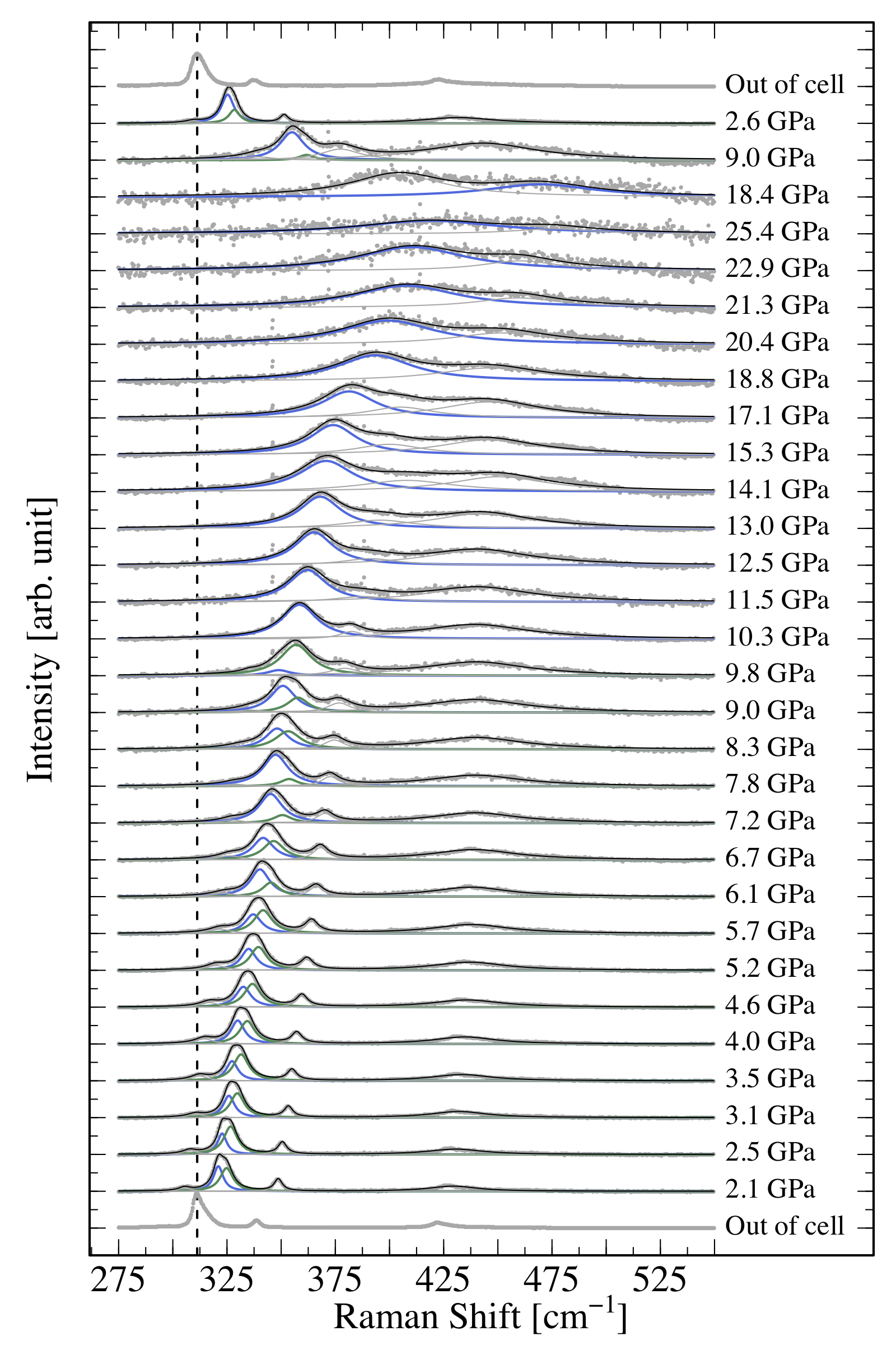{ width=50% }**Bonus:**- Looking at data for increasing pressures - Plot the data using an interactive slider (see about the `frame` option [here](https://plotly-r.com/animating-views.html)) - Plot the data using a 3D color map. Since the data are not on a regular grid, you will need to interpolate the data on a regular grid with the `akima` package and its `interp()` function. See chapter \@ref(colorplots) on 3D plotting for help.<details> <summary>Solution</summary>```{r include=TRUE, warning = FALSE, message=FALSE, cache=FALSE, fig.asp=1.2}# get the list of files for the ramps up and down and out of cellfiles_up <- list.files("Data/dataG/", pattern="up")files_down <- list.files("Data/dataG/", pattern="down")out_cell <- list.files("Data/dataG/", pattern="out")# store all file names in the correct orderallfiles <- c(out_cell, files_up, files_down)# load the wanted packagelibrary(tidyverse)library(ggplot2)# create the norm01 functionnorm01 <- function(x) { (x-min(x))/(max(x)-min(x)) }# initialize an empty tibble to store all dataalldata <- tibble()for (file in allfiles) {#file <- allfiles[1] # read the data and stor it in d d <- read_table(paste0("Data/dataG/",file), col_names=TRUE) # normalize data d$Int_n <- norm01(d$Int) # store file name d$name <- file # store run number for the stacking d$run_number <- which(file==allfiles) # store all data in a single tidy tibble alldata <- bind_rows(alldata, d)}# plot all dataalldata |> filter(w<=1750, w>=1500) |> # zoom on the interesting part ggplot(aes(x=w, y=Int_n + run_number - 1))+ # to stack the plots geom_point(color="gray", alpha=.5, size=.2)+ #plot data with points xlim(c(1500,1800))+ #add some white space on the right to write the pressure geom_vline(xintercept=1592, lty=2, size=1)+#show a vertical line annotate(geom = "text", size=5, #show the pressure values x = 1760, y=seq_along(allfiles)-1, hjust = 0, label = paste(unique(alldata$P),"GPa"), family = "Times")+ labs(x="Raman Shift [1/cm]", #have the good axis labels y="Intensity [arb. units]")+ theme_bw()+#black and white theme theme(legend.position = "none",#no legend text = element_text(size = 14, family = "Times"),#text in font Times axis.text.y = element_blank(),# no y axis values axis.text = element_text(size = 14), panel.grid.major = element_blank(), # no grid panel.grid.minor = element_blank())``````{r include=TRUE, warning = FALSE, message=FALSE, cache=FALSE}# Looking at data for increasing pressures, plot the data using an interactive sliderlibrary(plotly)P <- alldata |> filter(grepl("up",name)) |> # only increasing pressures filter(w<=1850, w>=1500) |> # zoom on the interesting part ggplot(aes(x=w, y=Int_n, frame=P))+ # each pressure in a new frame geom_point(color="gray", alpha=.5, size=1)+ #plot data with points labs(x="Raman Shift [1/cm]", #have the good axis labels y="Intensity [arb. units]")+ theme_bw()+#black and white theme theme(legend.position = "none",#no legend text = element_text(size = 14, family = "Times"), axis.text = element_text(size = 14), panel.grid.major = element_blank(), # no grid panel.grid.minor = element_blank())ggplotly(P, dynamicTicks = TRUE)``````{r include=TRUE, warning = FALSE, message=FALSE, cache=FALSE}# Plot the data using a 3D color map. Since the data are not on a regular grid, # you will need to interpolate the data on a regular grid # with the `akima` package and its `interp()` functionlibrary(akima)toplot <- alldata |> filter(grepl("up",name)) |> filter(w<=1850, w>=1500)toplot.interp <- with(toplot, interp(x = w, y = P, z = Int_n, duplicate="median", xo=seq(min(toplot$w), max(toplot$w), length = 100), yo=seq(min(toplot$P), max(toplot$P), length = 100), extrap=FALSE, linear=FALSE) )# toplot.interp is a list of 2 vectors and a matrixstr(toplot.interp)# Regrouping this list to a 3-columns data.framemelt_x <- rep(toplot.interp$x, times=length(toplot.interp$y))melt_y <- rep(toplot.interp$y, each=length(toplot.interp$x))melt_z <- as.vector(toplot.interp$z)toplot.smooth <- na.omit(data.frame(w=melt_x, Pressure=melt_y, Intensity=melt_z))# Plottingcolors <- colorRampPalette(c("white","royalblue","seagreen","orange","red","brown"))(500)P <- ggplot(data=toplot.smooth, aes(x=w, y=Pressure, fill=Intensity)) + geom_raster() + scale_fill_gradientn(colors=colors, name="Normalized\nIntensity\n[arb. units]") + labs(x = "Raman Shift [1/cm]",y="Pressure [GPa]") + theme_bw()+ theme(text = element_text(size = 14, family = "Times"), axis.text = element_text(size = 14), panel.grid.major = element_blank(), # no grid panel.grid.minor = element_blank())ggplotly(P, dynamicTicks = TRUE)```</details></details><details> <summary>**Exercise 4**</summary>- Download <a href="Data/population.csv" download target="_blank">population.csv</a> and load it into a `data.frame`{.R}- Is it a tidy `data.frame`{.R}? + Do we want a tidy `data.frame`{.R}? + Why? + Act accordingly- Plot the population vs. year with a color for each city + With points + With lines + With a black and white theme + Make it interactive- Try reproducing the following plots (Google is your friend) (look into the function `reorder()`{.R} and [this help](https://drsimonj.svbtle.com/ordering-categories-within-ggplot2-facets) to use it with facets):```{r echo=FALSE, message=FALSE, warning=FALSE}df <- read.csv("Data/population.csv")library(tidyr)df <- pivot_longer(df, cols=-year, names_to="City", values_to="Population")df$City <- gsub("\\.", " ", df$City)my_theme <- theme_bw()+ theme(axis.text = element_text(size = 14,family = "Helvetica",colour="black"), text = element_text(size = 14,family = "Helvetica"), axis.ticks = element_line(colour = "black"), legend.text = element_text(size = 10,family = "Helvetica",colour="black"), panel.border = element_rect(colour = "black", fill=NA, linewidth=1) )colors <- c("royalblue","red")p1 <- df |> filter(City%in%c("Montpellier","Nantes")) |> ggplot(aes(x=year, y=Population, size=Population, color=City)) + geom_point() + geom_smooth(method="lm", aes(fill=City), alpha=0.1, show.legend = FALSE) + scale_color_manual(values=colors)+ scale_fill_manual(values=colors)+ ggtitle("Population in Montpellier and Nantes")+ labs(x="Year", y="Population")+ my_theme p1p2 <- ggplot(data=subset(df,year==2012), aes(x=reorder(City,-Population), y=Population/1e6, fill=Population/1e6)) + geom_bar(stat="identity", position="dodge") + ggtitle("Population in 2012 (in millions)")+ labs(x="", y="Population (in millions)")+ scale_fill_gradientn(colors=colors, name="Population\n(in millions)") + my_theme + theme(axis.text.x = element_text(angle = 45, hjust=1))p2```<details><summary>Solution</summary>```r# Load and tidy population data.framelibrary(tidyverse)df <-read.csv("Data/population.csv")df <-pivot_longer(df, cols=-year, #year should stay a columnnames_to="City", #column names should go to the column `city`values_to="Population"#values should go to the column `population` )df$City <-gsub("\\.", " ", df$City) # replace dots by spaces in city names# Plot the population vs. year with a different color for each cityp <-ggplot(data=df, aes(x=year, y=Population, color=City))# With pointsp +geom_point()# With linesp +geom_line()# With a black and white theme# Change the axis labels to "year" and "Population"p <- p +geom_line() +theme_bw(); p# Make it interactivelibrary(plotly)ggplotly(p, dynamicTicks =TRUE)# Reproduce the plotsmy_theme <-theme_bw()+theme(axis.text =element_text(size =14,family ="Helvetica",colour="black"),text =element_text(size =14,family ="Helvetica"),axis.ticks =element_line(colour ="black"),legend.text =element_text(size =10,family ="Helvetica",colour="black"),panel.border =element_rect(colour ="black", fill=NA, linewidth=1) )colors <-c("royalblue","red")p1 <- df |>filter(City%in%c("Montpellier","Nantes")) |>ggplot(aes(x=year, y=Population, size=Population, color=City)) +geom_point() +geom_smooth(method="lm", aes(fill=City), alpha=0.1, show.legend =FALSE) +scale_color_manual(values=colors)+scale_fill_manual(values=colors)+ggtitle("Population in Montpellier and Nantes")+labs(x="Year", y="Population")+ my_theme p1p2 <- df |>filter(year==2012) |>ggplot(aes(x=reorder(City,-Population), y=Population/1e6, fill=Population/1e6)) +geom_bar(stat="identity", position="dodge") +ggtitle("Population in 2012 (in millions)")+labs(x="", y="Population (in millions)")+scale_fill_gradientn(colors=colors, name="Population\n(in millions)") + my_theme +theme(axis.text.x =element_text(angle =45, hjust=1))p2```</details></details><br><br><br><br><br>